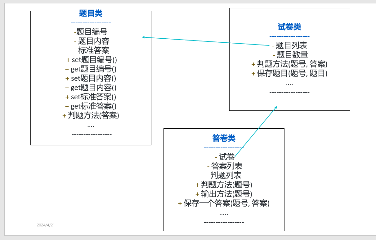
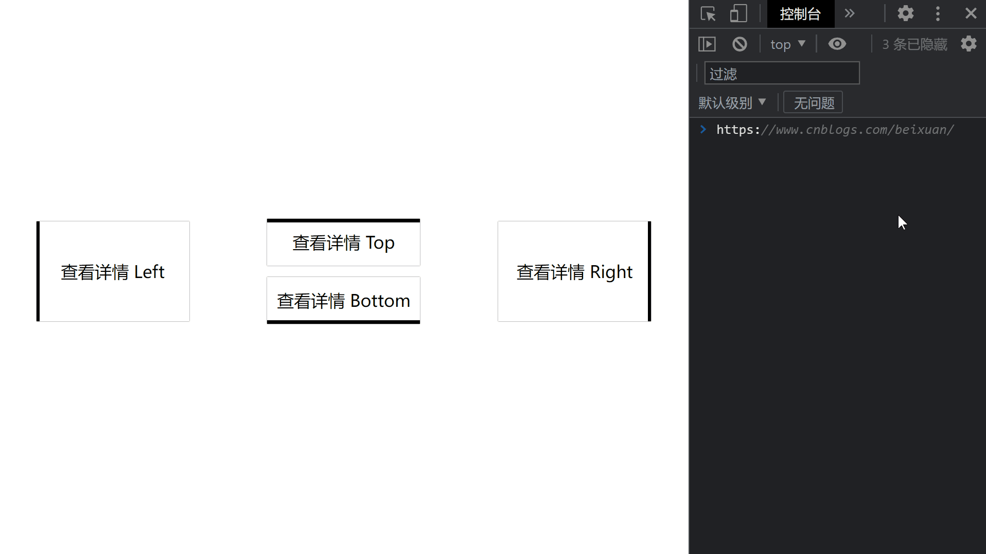
效果预览
代码
<!DOCTYPE html>
<html>
    <head>
        <meta charset="utf-8" />
        <meta name="author" content="https://www.cnblogs.com/beixuan">
        <meta name="version" content="1.0.0">
        <meta name="date" content="2021/12/01 18:00:26">
        <meta name="viewport" content="width=device-width, initial-scale=1">
        <title>CSS动画大全之按钮[b]</title>
    </head>
    <style type="text/css">

      /* 设置 body 内、外边距为 0 */
      body {
        margin: 0;
        padding: 0;
        display: grid;
        grid-template-columns: 100%;
        grid-template-rows: 100%;
        justify-items: center;
        align-items: center;
        width: 100vw;
        height: 100vh;
        background-color: #FFF;
      }

      .page-wrapper {
        display: grid;
        grid-template-columns: 33% 34% 33%;
        grid-template-rows: 100%;
        justify-items: center;
        align-items: center;
        width: 100vw;
        height: 100vh;
      }

      .page-wrapper > div {
        display: inline-block;
      }

      .btn {
        width: 12.5rem;
        height: 3.125rem;
        line-height: 3.125rem;
        font-size: 1.5rem;
        padding: 0.5rem;
        text-align: center;
        box-shadow: 0 0 1px #000;
        position: relative;
        transition: color 0.2s;
        margin-bottom: 1rem;
        cursor: pointer;
      }

      .btn:hover {
        color: #FFF;
      }

      .btn-type-left, .btn-type-right {
        height: 7.85rem;
        line-height: 7.85rem;
      }

      .btn-type-top::after {
        content: '';
        width: 100%;
        height: 0.3rem;
        position: absolute;
        top: 0;
        left: 0;
        background-color: #000000;
        transition: all 0.4s;
        z-index: -1;
      }

      .btn-type-top:hover::after {
        content: '';
        width: 100%;
        height: 100%;
        position: absolute;
        top: 0;
        left: 0;
        background-color: #000000;
      }

      .btn-type-right::after {
        content: '';
        width: 0.3rem;
        height: 100%;
        position: absolute;
        bottom: 0;
        right: 0;
        background-color: #000000;
        transition: all 0.2s;
        z-index: -1;
      }

      .btn-type-right:hover::after {
        content: '';
        width: 100%;
        height: 100%;
        position: absolute;
        bottom: 0;
        right: 0;
        background-color: #000000;
      }

      .btn-type-bottom::after {
        content: '';
        width: 100%;
        height: 0.3rem;
        position: absolute;
        bottom: 0;
        left: 0;
        background-color: #000000;
        transition: all 0.4s;
        z-index: -1;
      }

      .btn-type-bottom:hover::after {
        content: '';
        width: 100%;
        height: 100%;
        position: absolute;
        bottom: 0;
        left: 0;
        background-color: #000000;
      }

      .btn-type-left::after {
        content: '';
        width: 0.3rem;
        height: 100%;
        position: absolute;
        bottom: 0;
        left: 0;
        background-color: #000000;
        transition: all 0.2s;
        z-index: -1;
      }

      .btn-type-left:hover::after {
        content: '';
        width: 100%;
        height: 100%;
        position: absolute;
        bottom: 0;
        left: 0;
        background-color: #000000;
      }
    </style>
    <body>
      <!-- 页面容器 -->
      <div class="page-wrapper">
        <div class="btn btn-type-left">查看详情 Left</div>
        <div>
          <div class="btn btn-type-top">查看详情 Top</div>
          <div class="btn btn-type-bottom">查看详情 Bottom</div>
        </div>
        <div class="btn btn-type-right">查看详情 Right</div>
      </div>
    </body>
</html>
往期回顾
【全】一、CSS动画大全之按钮组【a】