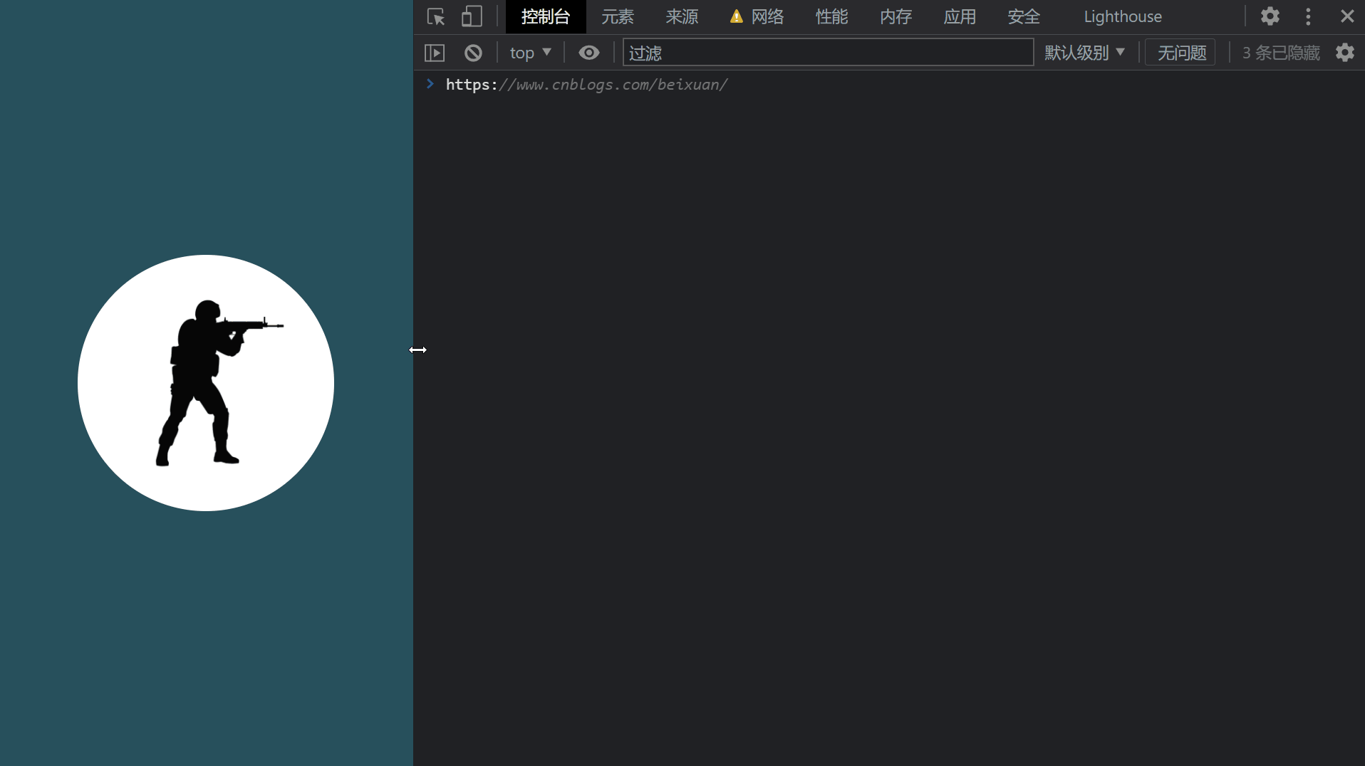
效果预览
代码
<!DOCTYPE html>
<html>
    <head>
        <meta charset="utf-8" />
        <meta name="author" content="https://www.cnblogs.com/beixuan">
        <meta name="version" content="1.0.0">
        <meta name="date" content="2021/12/05 14:07:50">
        <meta name="viewport" content="width=device-width, initial-scale=1">
        <title>CSS动画大全之移动盒子显示详情</title>
    </head>
    <style type="text/css">

      /* 设置 body 内、外边距为 0 */
      body {
        margin: 0;
        padding: 0;
        background: #27515c;
      }

      /* 页面容器 */
      .page-wrapper {
        width: 100vw;
        height: 100vh;
        display: grid;
        grid-template-columns: 100%;
        grid-template-rows: 100%;
        justify-items: center;
        align-items: center;
        position: relative;
      }

      .content {
        position: absolute;
        top: 50%;
        left: 50%;
        width: 18rem;
        height: 18rem;
        transform: translate(-50%, -50%);
        background-color: #FFF;
        border-radius: 50%;
        display: grid;
        justify-items: left;
        align-items: center;
        box-sizing: border-box;
        padding-left: 2rem;
        transition: all 0.8s ease;
      }

      .content:hover {
        width: 25rem;
        border-radius: 12px;
      }

      img {
        position: absolute;
        top: 50%;
        left: 50%;
        transform: translate(-50%, -50%);
        transition: all 1s ease;
      }

      .content:hover img {
        left: 75%;
        transform: translateY(-60%) scale(1.9);
      }

      .text {
        width: 100%;
        overflow: hidden;
      }

      .text > p {
        font-size: 20px;
        letter-spacing: 3px;
        color: #00007f;
        font-weight: 600;
        width: 100%;
        transform: translateX(200%);
        transition: all 0.6s ease;
      }

      .text > span {
        font-size: 12px;
        display: inline-block;
        width: 100%;
        transform: translateX(200%);
        transition: all 0.4s ease;
      }

      .text > span:nth-child(2) {
        transition: all 0.8s ease;
      }
      .text > span:nth-child(3) {
        transition: all 0.9s ease;
      }
      .text > span:nth-child(4) {
        transition: all 1s ease;
      }
      .text > span:nth-child(5) {
        transition: all 1.1s ease;
      }

      .content:hover .text > span, .content:hover .text > p{
        transform: translateX(0%);
        opacity: 1;
      }

      @media screen and (max-width: 800px) {
        .content {
          position: absolute;
          top: 50%;
          left: 50%;
          width: 18rem;
          height: 18rem;
          transform: translate(-50%, -50%);
          background-color: #FFF;
          border-radius: 50%;
          display: grid;
          justify-items: center;
          align-items: start;
          box-sizing: border-box;
          padding-left: 2rem;
          transition: all 0.8s ease;
        }

        .content:hover {
          height: 26rem;
          border-radius: 12px;
        }

        .content:hover img {
          position: absolute;
          bottom: 0;
          left: 50%;
          transform: translate(-50%, 0%) scaleX(-1);
          transition: all 0.5s ease;
        }
      }
    </style>
    <body>
      <!-- 页面容器 -->
      <div class="page-wrapper">
        <div class="content">
          <div class="text">
            <p> 反恐精英Online </p>
            <span> 玩家最喜爱的FPS人气网游,火爆战场真实体验! </span>
            <span> [反恐精英OL]神器之下[神器]!12月7日紧急发布 </span>
            <span> [反恐精英OL]神器之中[神器]!12月6日紧急发布 </span>
            <span> [反恐精英OL]神器之上[神器]!12月5日紧急发布 </span>
          </div>
          <img src="./cs.png" height="190" />
        </div>
    </body>
</html>
图片资源