H5标签兼容
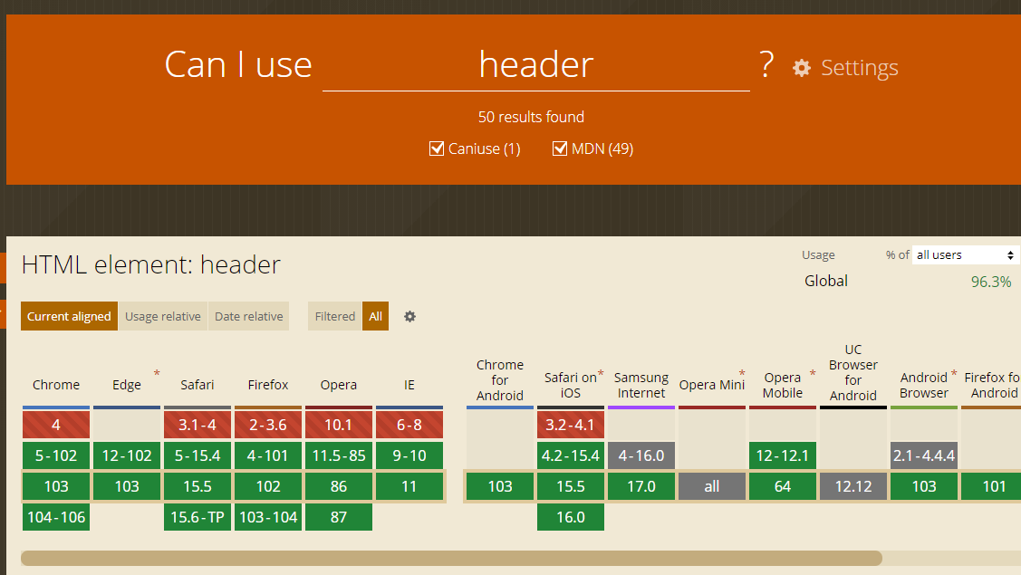
使用的标签容器如header标签,在ie旧版本不支持,可提前查看是哪些版本不支持 https://caniuse.com
如果要兼容IE浏览器,可引入html5shiv.js文件
JS浏览器兼容性
进行特性检测,而不是浏览器检测,如
window.requestAnimFrame = (function () {
         return window.requestAnimationFrame ||
             window.webkitRequestAnimationFrame ||
             window.mozRequestAnimationFrame ||
             function (callback) {
                 window.setTimeout(callback, 6000 / 60);
             };
     })();
CSS3兼容
增加厂商前缀,或使用工程化手段,自动添加 Modernizr
<style>
        header, footer {
            width: 100%;
            height: 50px;
        }
        header {
            background-color: red;

            /*display: -webkit-flex;
            display: -moz-flex;
            display: -ms-flex;
            display: -o-flex;
            display: flex;
            justify-content: center;
            -ms-align-items: center;
            align-items: center;*/
            /*text-align: center;
            line-height: 50px;*/
        }
        footer {
            background-color: green;
        }

        .flexbox header {
            display: -webkit-flex;
            display: -moz-flex;
            display: -ms-flex;
            display: -o-flex;
            display: flex;
            justify-content: center;
            -ms-align-items: center;
            align-items: center;
        }
        .no-flexbox header {
            text-align: center;
            line-height: 50px;
        }
    </style>
    <script src="js/html5shiv.min.js"></script>
click 300ms延迟
double clike 双击事件引起,导致单机事件有等待时间延迟
谷歌解决方案 添加 width=device-width不会出现双击放大的情况,禁止延迟
引入fastclick.js
if ('addEventListener' in document) {
            document.addEventListener('DOMContentLoaded', function() {
                FastClick.attach(document.body);
            }, false);
        }
单行和多行文字溢出省略
单行文字溢出隐藏
.text-ellipsis{
    overflow:hidden;
    text-overflow:ellipsis;
    white-space:nowrap;
}
多行文字溢出隐藏
.multiline-ellipsis {
            overflow: hidden;
            text-overflow: ellipsis;
            display: -webkit-box;
            -webkit-line-clamp: 2;
            -webkit-box-orient: vertical;
            white-space: normal !important;
            word-wrap: break-word;
        }
水平居中和垂直居中
1.万能的flex布局
.modal-wrapper {
            display: flex;
            justify-content: center;
            align-items: center;
        }
2.容器水平垂直居中
position: absolute;
left: 50%;
top: 50%;
transform: translate(-50%, -50%);