谁懂啊家人们,html+css居然可以做一个时钟出来,这么厉害的吗
咱这新手是啥也不懂啊,就会复制粘贴,反正是可以正常显示的
话不多说直接上代码,直接复制即可正常运行
<!DOCTYPE html>
<html lang="en">
    <head>
        <meta charset="utf-8">
        <meta http-equiv="X-UA-Compatible" content="IE=edge">
        <meta name="viewport" content="width=device-width,initial-scale=1.0">
        <title>时钟</title>
        <style>
            * {
                margin: 0;
                padding: 0;
                box-sizing: border-box;
            }

            section {
                width: 500px;
                height: 500px;
                margin: 50px auto;
                border: 1px solid red;
                background-color: black;
                display: flex;
                align-items: center;
                justify-content: center;
            }

            section .box {
                width: 400px;
                height: 400px;
                border: 10px solid #fff;
                border-radius: 50%;
                background-color: antiquewhite;
                position: relative;
                box-shadow: inset 0px 0px 25px rgb(115,112,112);
                text-align: center;
            }

            section .box div {
                position: absolute;
                left: 0;
                right: 0;
                top: 0;
                margin: auto;
                /* 设置原点 */
                transform-origin: center bottom;
            }

            span {
                font-size: 22px;
                position: absolute;
                height: 100%;
                left: 0;
                right: 0;
                margin: auto;
                padding: 10px;
            }

            span i:nth-of-type(1){
                display: inline-block;
            }

            .center {
                bottom: 0;
                width: 20px;
                height: 20px;
                border-radius: 50%;
                background-color: rgb(0,0,0);
                z-index: 999;
            }

            .shi {
                width: 10px;
                height: 80px;
                background-color: rgb(252,12,12);
                bottom: 80px;
                border-radius: 5px;
            }

            .fen {
                width: 10px;
                height: 100px;
                background-color: rgb(13,0,254);
                bottom: 100px;
                border-radius: 5px;
            }

            .miao {
                width: 10px;
                height: 120px;
                bottom: 120px;
                background-color: rgb(198,255,9);
                border-radius: 5px;
            }
        </style>
    </head>

    <body>
        <section>
            <div class="box">
                <span><i>1</i></span>
                <span><i>2</i></span>
                <span><i>3</i></span>
                <span><i>4</i></span>
                <span><i>5</i></span>
                <span><i>6</i></span>
                <span><i>7</i></span>
                <span><i>8</i></span>
                <span><i>9</i></span>
                <span><i>10</i></span>
                <span><i>11</i></span>
                <span><i>12</i></span>

                <div class="center"></div>
                <div class="shi"></div>
                <div class="fen"></div>
                <div class="miao"></div>
            </div>
        </section>
    </body>

    <script>
        var span = document.querySelectorAll('.box span');
        var is = document.querySelectorAll('.box span i');
        console.log(i);
        for (var i = 0; i < span.length; i++) {
            span[i].style.transform = `rotate(${(i + 1) * 30}deg)`;
            is[i].style.transform = `rotate(${-(i + 1) * 30}deg)`;
        }

        var shi = document.querySelector('.shi');
        var fen = document.querySelector('.fen');
        var miao = document.querySelector('.miao');


        function Time() {
            this.ho = function (h) {
                shi.style.transform = `rotate(${(h * 30)}deg)`
            }
            this.mi = function (f) {
                fen.style.transform = `rotate(${(f * 6)}deg)`

            }
            this.se = function (m) {
                miao.style.transform = `rotate(${(m * 6)}deg)`
            }
        }

        function move() {
            var date = new Date();
            //秒
            var s = date.getSeconds();
            //分
            var f = date.getMinutes() + s / 60;
            //时
            var h = date.getHours() + f / 60;
            //实例化构造函数
            var time = new Time();
            time.ho(h);
            time.mi(f);
            time.se(s);
        }
        move();
        //计时函数
        setInterval(move, 1000);

    </script>
</html>
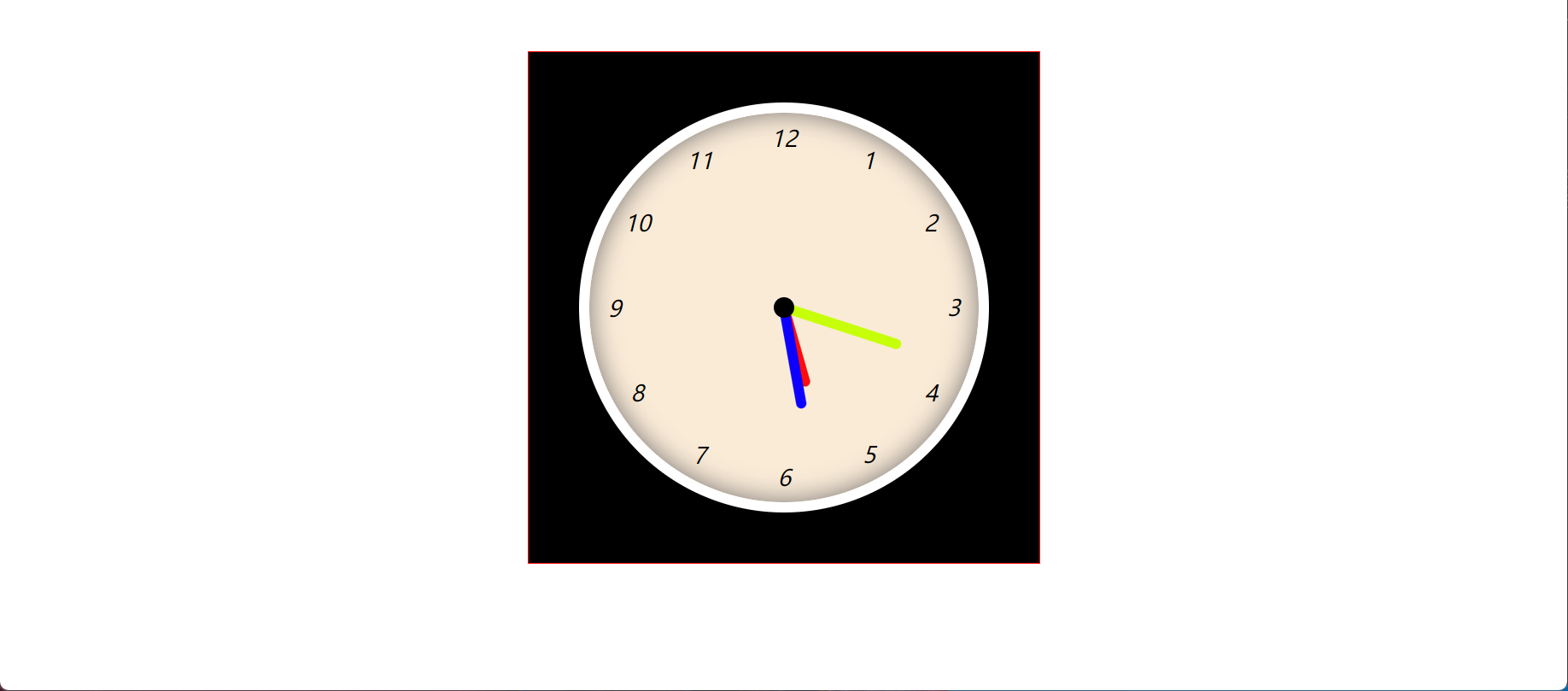
直接运行就行了,运行好如下图所示,太牛了
完毕