需求实战一
效果展示
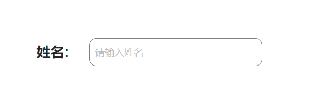
代码展示
<template>
<div style="display: flex;">
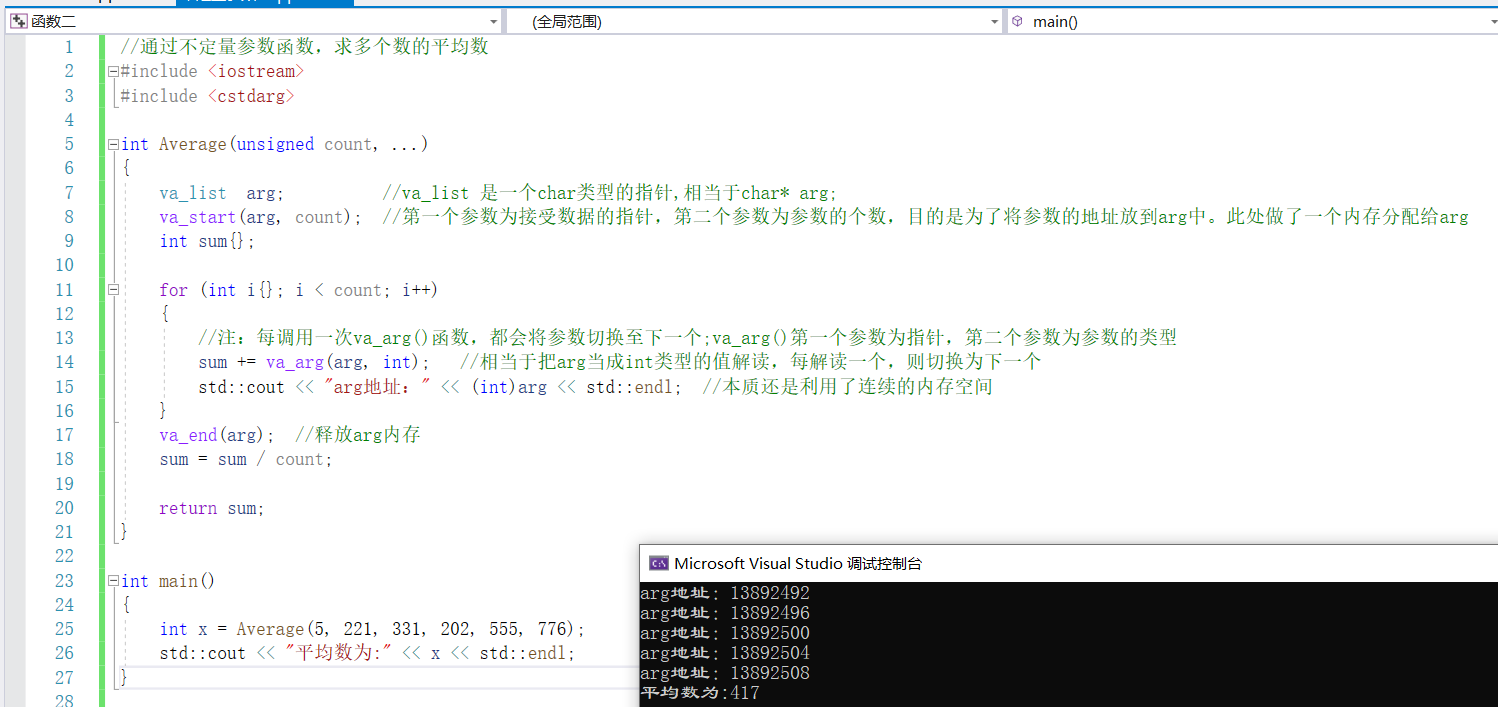
<div style="display: flex; justify-content: center; align-items: center;">
<label for="input" style="font-family: Arial; font-size: 20px; font-weight: bold;">姓名:</label>
</div>


<div>
<a-input id="input" v-model:value="value" placeholder="请输入姓名" class="custom-input" />
</div>
</div>
</template>
<script setup lang="ts">
const value = ref<string>('');
</script>
<style scoped>
:deep(.custom-input) {
border: 1px solid gray;
width:250px;
border-radius: 10px;
padding: 8px;
}
:deep(label) {
margin-right: 10px;
}
</style>代码解释
这段代码是一个Vue组件的模板部分,用于创建一个包含姓名输入框的表单。
在模板中,使用了Flex布局来将姓名标签和输入框放在同一行。姓名标签使用了<label>元素,并设置了字体样式。输入框使用了<a-input>元素,并绑定了value属性,通过v-model指令实现双向数据绑定。输入框还设置了占位符文本和自定义样式类名。
在脚本部分,使用了ref函数创建了一个名为value的响应式数据,用于存储输入框的值。
在样式部分,使用了:deep伪类选择器来选择嵌套的元素,并设置了输入框和标签的样式,包括边框、宽度、边框半径和内边距等。
这段代码可以用于在Vue项目中创建一个带有姓名输入框的表单组件。
需求实战二
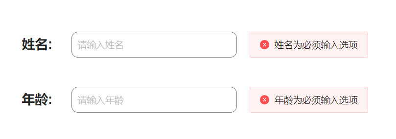
效果展示
代码展示
<template>
<div>
<div style="display: flex;">
<div style="display: flex; justify-content: center; align-items: center;">
<label for="input" style="font-family: Arial; font-size: 20px; font-weight: bold;">姓名:</label>
</div>


<div style="display: flex;">
<a-input id="input" v-model:value="name" placeholder="请输入姓名" class="custom-input" :show-word-limit="true" />


<a-alert v-if="name === ''" type="error" message="姓名为必须输入选项" show-icon />
</div>
</div>
<br>
<br>
<div style="display: flex;">
<div style="display: flex; justify-content: center; align-items: center;">
<label for="input" style="font-family: Arial; font-size: 20px; font-weight: bold;">年龄:</label>
</div>


<div style="display: flex;">
<a-input id="input" v-model:value="age" placeholder="请输入年龄" class="custom-input" :show-word-limit="true" />


<a-alert v-if="age === ''" type="error" message="年龄为必须输入选项" show-icon />
</div>
</div>
</div>
</template>
<script setup lang="ts">
const name = ref<string>('');
const age = ref<string>('');
</script>
<style scoped>
:deep(.custom-input) {
border: 1px solid gray;
width:250px;
border-radius: 10px;
padding: 8px;
}
:deep(label) {
margin-right: 10px;
}
</style>代码解释
这段代码是一个Vue组件的模板,用于创建一个包含姓名和年龄输入框的表单。以下是代码的解释:
- 在模板的顶部,我们使用了<div>元素来包裹整个表单。
- 表单中的每个输入框都被包裹在一个<div>元素中,并使用display: flex来实现水平排列。
- 每个输入框都由一个<label>元素和一个<a-input>元素组成。
- <label>元素用于显示输入框的标签,例如"姓名"和"年龄"。
- <a-input>元素是一个自定义的输入框组件,通过v-model:value指令将输入框的值与Vue实例中的name和age变量进行双向绑定。
- 输入框的样式通过.custom-input类进行自定义,包括边框、宽度、边框半径和内边距。
- 如果输入框的值为空,将显示一个错误提示框<a-alert>,提示用户该字段为必填项。
在<script setup>部分,我们使用了Vue 3的新特性<script setup>,它允许我们以更简洁的方式编写组件的逻辑部分。在这里,我们使用ref函数创建了name和age的响应式变量。
最后,<style scoped>部分定义了组件的样式,其中:deep()选择器用于选择组件内部的元素,并对其应用样式。在这里,我们为.custom-input类和<label>元素定义了一些样式。scoped属性表示这些样式仅适用于当前组件。
需求实战三
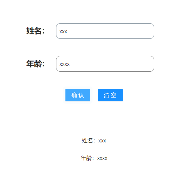
效果展示
代码展示
<template>
<div>
<div style="display: flex;">
<div style="display: flex; justify-content: center; align-items: center;">
<label for="input" style="font-family: Arial; font-size: 20px; font-weight: bold;">姓名:</label>
</div>


<div style="display: flex;">
<a-input id="input" v-model:value="name" placeholder="请输入姓名" class="custom-input" :show-word-limit="true" />


<a-alert v-if="name === ''" type="error" message="姓名为必须输入选项" show-icon />
</div>
</div>
<br>
<br>
<div style="display: flex;">
<div style="display: flex; justify-content: center; align-items: center;">
<label for="input" style="font-family: Arial; font-size: 20px; font-weight: bold;">年龄:</label>
</div>


<div style="display: flex;">
<a-input id="input" v-model:value="age" placeholder="请输入年龄" class="custom-input" :show-word-limit="true" />


<a-alert v-if="age === ''" type="error" message="年龄为必须输入选项" show-icon />
</div>
</div>
<br>
<br>
<div>
<div style="display: flex; justify-content: center; align-items: center;">
<a-button type="primary" @click="submit">确认</a-button>


<a-button type="primary" @click="clear">清空</a-button>
</div>
</div>
<br>
<br>
<br>
<br>
<div v-show="judge" >
<div style="justify-content: center; align-items: center;text-align:center">
姓名:{{name}}
</div>
<br>
<div style="justify-content: center; align-items: center;text-align:center">
年龄:{{age}}
</div>
</div>
</div>
</template>
<script setup lang="ts">
const name = ref<string>('');
const age = ref<string>('');
const judge =ref<boolean>(false);
const submit = () => {
judge.value=true;
}
const clear = () => {
judge.value=false;
age.value='';
name.value='';
}
</script>
<style scoped>
:deep(.custom-input) {
border: 1px solid gray;
width:250px;
border-radius: 10px;
padding: 8px;
}
:deep(label) {
margin-right: 10px;
}
</style>代码解释
这段代码是一个简单的Vue组件,用于展示一个表单,包括姓名和年龄的输入框以及确认和清空按钮。下面是代码的解释:
1. 在模板中,使用了flex布局来排列元素。首先是姓名输入框和错误提示的部分,然后是年龄输入框和错误提示的部分,最后是确认和清空按钮的部分。
2. 使用了<a-input>组件来创建输入框,通过v-model:value指令将输入框的值与name和age变量进行双向绑定。placeholder属性设置了输入框的占位符文本,class属性设置了输入框的样式,show-word-limit属性设置了是否显示字数限制。
3. 使用了<a-alert>组件来显示错误提示。通过v-if指令判断name和age是否为空,如果为空则显示错误提示。type属性设置了错误提示的类型为error,message属性设置了错误提示的文本内容,show-icon属性设置了是否显示错误提示的图标。
4. 使用了<a-button>组件来创建确认和清空按钮。通过@click事件监听按钮的点击事件,分别调用submit和clear方法。
5. 在<div v-show="judge">中,使用了v-show指令来根据judge变量的值来控制元素的显示和隐藏。当judge为true时,显示姓名和年龄的值。
6. 在<script setup>中,使用了Vue 3的新特性<script setup>来编写组件的逻辑部分。通过ref函数创建了name、age和judge的响应式变量。
7. submit方法用于确认按钮的点击事件,将judge的值设置为true,从而显示姓名和年龄的值。
8. clear方法用于清空按钮的点击事件,将judge的值设置为false,同时将age和name的值清空。
9. 在<style scoped>中,使用了scoped属性来限定样式的作用范围。使用:deep()伪类选择器来选择子组件的样式,设置了输入框和标签的样式。
需求实战四
效果展示
代码展示
<template>
<div>
<div style="display: flex;">
<div style="display: flex; justify-content: center; align-items: center;">
<label for="nameInput" style="font-family: Arial; font-size: 20px; font-weight: bold;">姓名:</label>
</div>


<div style="display: flex;">
<a-input id="nameInput" v-model:value="name" placeholder="请输入姓名" class="custom-input" :show-word-limit="true" />


<a-alert v-if="name === ''" type="error" message="姓名为必须输入选项" show-icon />
<a-alert v-if="name !== '' && !isValidName" type="error" message="姓名不允许输入数字和特殊符号" show-icon />
</div>
</div>
<br>
<br>
<div style="display: flex;">
<div style="display: flex; justify-content: center; align-items: center;">
<label for="ageInput" style="font-family: Arial; font-size: 20px; font-weight: bold;">年龄:</label>
</div>


<div style="display: flex;">
<a-input id="ageInput" v-model:value="age" placeholder="请输入年龄" class="custom-input" :show-word-limit="true" />


<a-alert v-show="age === ''" type="error" message="年龄为必须输入选项" show-icon />
<a-alert v-show="age !== '' && !isValidAge" type="error" message="年龄只允许输入数字" show-icon />
</div>
</div>
<br>
<br>
<div>
<div style="display: flex; justify-content: center; align-items: center;">
<a-button type="primary" @click="submit">确认</a-button>
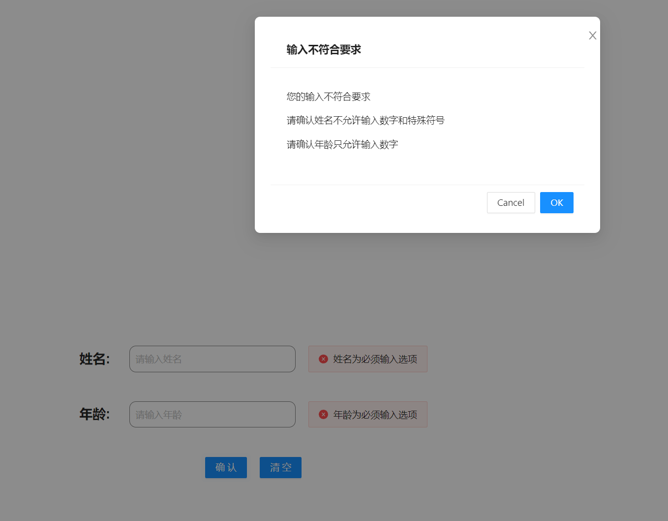
<a-modal v-model:visible="visible" title="输入不符合要求" @ok="close">
<p>您的输入不符合要求</p>
<p>请确认姓名不允许输入数字和特殊符号</p>
<p>请确认年龄只允许输入数字</p>
</a-modal>


<a-button type="primary" @click="clear">清空</a-button>
</div>
</div>
<br>
<br>
<br>
<br>
<div v-show="judge" >
<div style="justify-content: center; align-items: center;text-align:center">
姓名:{{name}}
</div>
<br>
<div style="justify-content: center; align-items: center;text-align:center">
年龄:{{age}}
</div>
</div>
</div>
</template>
<script setup lang="ts">
const name = ref<string>('');
const age = ref<string>('');
const judge = ref<boolean>(false);
const visible = ref<boolean>(false);
const isValidName = computed(() => {
const regex = /^[^\d\W]+$/;
return regex.test(name.value);
});
const isValidAge = computed(() => {
const regex = /^\d+$/;
return regex.test(age.value);
});
const close =()=>{
visible.value=false;
}
const submit = () => {
if (!isValidName.value || !isValidAge.value) {
visible.value = true;
} else {
visible.value = false;
judge.value = true;
}
}
const clear = () => {
judge.value = false;
age.value = '';
name.value = '';
}
</script>
<style scoped>
:deep(.custom-input) {
border: 1px solid gray;
width: 250px;
border-radius: 10px;
padding: 8px;
}
:deep(label) {
margin-right: 10px;
}
</style>代码解释
这段代码是一个Vue组件,用于实现一个简单的表单输入和验证功能。下面是代码的解释:
1. 首先定义了三个响应式变量:name、age和judge。name和age分别用于存储输入的姓名和年龄,judge用于控制是否显示输入结果。
2. 使用computed属性isValidName和isValidAge来进行姓名和年龄的验证。isValidName使用正则表达式来判断姓名是否只包含字母,不包含数字和特殊符号;isValidAge使用正则表达式来判断年龄是否只包含数字。
3. 定义了一个visible变量,用于控制模态框的显示和隐藏。
4. close函数用于关闭模态框,将visible设置为false。
5. submit函数用于提交表单。如果姓名或年龄不符合要求,则将visible设置为true,显示模态框;否则将visible设置为false,将judge设置为true,显示输入结果。
6. clear函数用于清空表单和输入结果,将judge设置为false,将name和age清空。
7. 在模板中,使用a-input组件实现输入框,v-model绑定name和age的值,placeholder设置输入框的提示文字。使用a-alert组件来显示错误提示信息,根据条件判断是否显示。
8. 使用a-button组件实现确认和清空按钮,@click绑定对应的函数。
9. 使用a-modal组件实现模态框,v-model绑定visible的值,title设置模态框的标题,@ok绑定close函数。
10. 使用插值表达式{{}}来显示输入结果。
11. 使用scoped样式对组件内部的样式进行限定,自定义了.custom-input和label的样式。
这段代码实现了一个简单的表单输入和验证功能,当姓名或年龄不符合要求时,会显示错误提示信息;当输入符合要求时,点击确认按钮会显示输入结果。


![[数据结构] 栈 (C语言)](https://img2023.cnblogs.com/blog/3039354/202301/3039354-20230119211454737-2099370575.jpg)