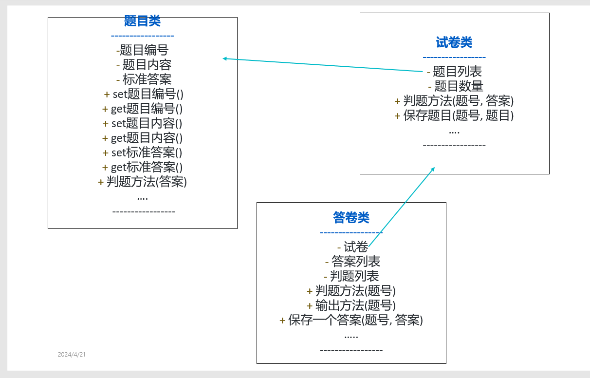
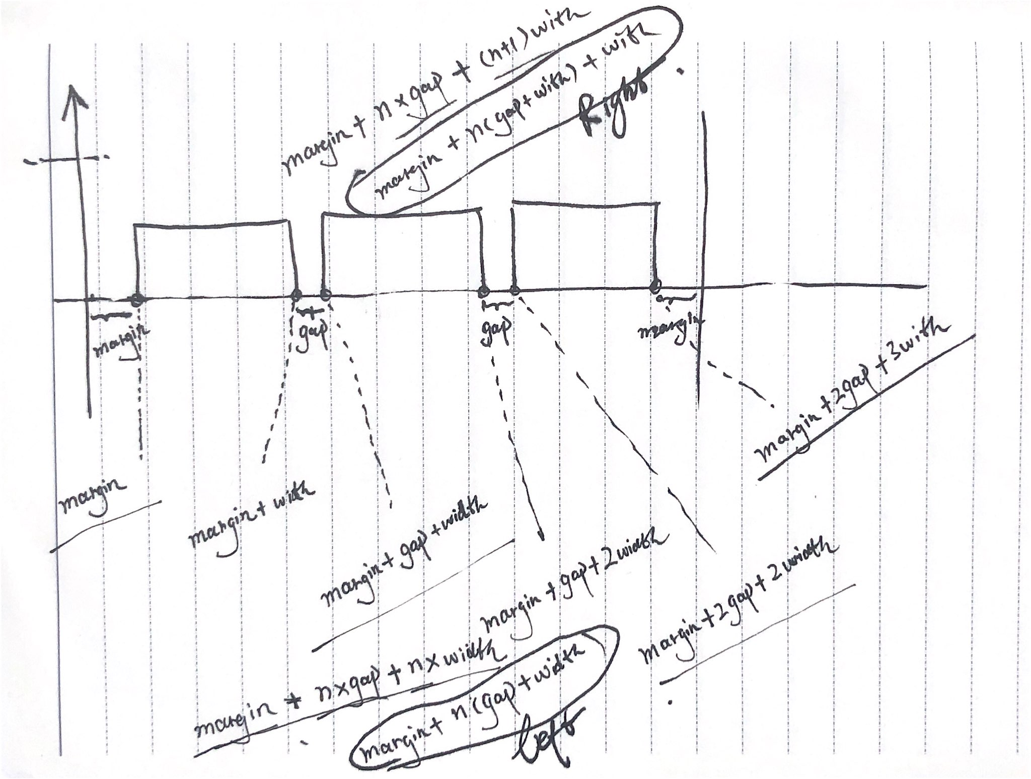
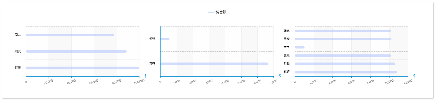
其实很简单,简单画一画就清楚了,大致的关系如下图示:
实例数据如下:
{
  "dataSource": [
    {
      "name": "一组",
      "currencySymbol": "¥",
      "value": [
        {
          "name": "赵强",
          "value": 99999
        },
        {
          "name": "刘波",
          "value": 88888
        },
        {
          "name": "周亮",
          "value": 77777
        }
      ]
    },
    {
      "name": "二组",
      "currencySymbol": "¥",
      "value": [
        {
          "name": "方齐",
          "value": 6666
        },
        {
          "name": "郑强",
          "value": 555
        }
      ]
    },
    {
      "name": "三组",
      "currencySymbol": "¥",
      "value": [
        {
          "name": "懿轩",
          "value": 10810.74
        },
        {
          "name": "哲瀚",
          "value": 10603.07
        },
        {
          "name": "昊焱",
          "value": 10169.32
        },
        {
          "name": "天宇",
          "value": 1022.98
        },
        {
          "name": "雪松",
          "value": 10207.0
        },
        {
          "name": "靖琪",
          "value": 10163.52
        }
      ]
    }
  ]
}
完整组件代码
<template>
<div />
</template>

<script>
// import resize from "@/views/dashboard/mixins/resize";
import Color from '@/views/dashboard/css/theme.js'

export default {
// mixins: [resize],
props: {
 dataSource: {
   // 不直接传入轴数据 和 系列数据的原因是因为tooltip 需要展示额外的数据字段,ringRatio
   type: Array,
   default: () => [],
 },
},
data() {
 return {
   chart: null,
 }
},
computed: {
 // xAxisData: function () {
 //   // 从props 中取出轴数据
 //   return this.dataSource.map((it) => it.time)
 // },
 // seriesData1: function () {
 //   // 从props 中取出系列
 //   return this.dataSource.map((it) => it.count * 0.2)
 // },
 // seriesData2: function () {
 //   // 从props 中取出系列
 //   return this.dataSource.map((it) => it.amount)
 // },
},
watch: {
 // 监听数据变化,触发图表绘制刷新
 dataSource: {
   handler(val) {
     this.drawChart()
   },
 },
},
mounted() {
 this.chart = this.$echarts.init(this.$el, 'macarons')
 this.drawChart()
},
beforeDestroy() {
 if (!this.chart) {
   return
 }
 this.chart.dispose()
 this.chart = null
},
methods: {
 drawChart() {
   let _this = this
   let grid = []
   let yAxis = []
   let xAxis = []
   let series = []
   let color = Color.ColorSeries

   _this.dataSource.forEach((it, index) => {
     function stucGrid() {
       // 构建grid数据
       let gap = 20 //间距
       let margin = 3
       let length = _this.dataSource.length // 数组长度
       let width = (100 - gap * (length - 1) - 2 * margin) / length // 每个grid的宽度,减去的gap 是最后一个grid的right值
       grid.push({
         id: it.name,
         top: 0,
         bottom: '10%',
         left: margin + index * (gap + width) + '%',
         right: 100 - (margin + index * (gap + width) + width) + '%',
       })
       console.log(grid, '--line80')
     }
     function strucyAxis() {
       let temp = Object.assign(
         {
           gridIndex: index,
         },
         new Object({
           show: true,
           type: 'category',
           nameTextStyle: {
             fontSize: 14,
             fontFamily: 'Microsoft YaHei',
             align: 'right',
             color: '#000',
           },
           offset: 10,
           axisTick: {
             show: false,
           },
           axisLine: {
             show: true,
             lineStyle: {
               color: '#d8d8d8',
             },
           },
           axisLabel: {
             fontSize: 10,
             color: '#000',
           },
           splitLine: {
             show: false,
             lineStyle: {
               color: '#d8d8d8',
               width: 1,
               type: 'dashed',
             },
           },
           data: it.value.map((_it) => _it.name),
         })
       )
       yAxis.push(temp)
     }
     function strucxAxis() {
       let temp = Object.assign(
         {
           gridIndex: index,
         },
         new Object({
           name: '$',
           type: 'value',
           inverse: false,
           // boundaryGap: true,
           axisLine: {
             show: true,
             lineStyle: {
               color: '#d8d8d8',
             },
           },
           axisTick: {
             show: true,
             alignWithLabel: true,
           },
           axisLabel: {
             color: 'rgba(0, 0, 0, 0.85)',
             fontSize: 10,
             interval: 0, // 标签细粒度
             rotate: 20,
             align: 'center',
             margin: 20, //标签与轴线的距离
             // verticalAlign: 'bottom',
           },
           splitLine: {
             show: true,
             lineStyle: {
               color: '#d8d8d8',
               width: 1,
               type: 'dashed',
             },
           },
           splitArea: {
             show: false,
           },
         })
       )
       xAxis.push(temp)
     }
     function strucSeries() {
       let temp = {
         name: '销售额', // lengend need this
         type: 'bar',
         smooth: true,
         showSymbol: true,
         symbol: 'diamond',
         symbolSize: 8,
         // barGap: '-100%',
         xAxisIndex: index,
         yAxisIndex: index,
         data: it.value.map((_it) => _it.value),
         label: {
           show: true,
           position: 'right', //top / left / right / bottom / inside / insideLeft / insideRight / insideTop / insideBottom / insideTopLeft / insideBottomLeft / insideTopRight / insideBottomRight。
           // color: '#fff',
           formatter: '{c}' + '(' + it.currencySymbol + ')',
         },
         barWidth: 20,
         itemStyle: {
           borderRadius: 8,
           color: new _this.$echarts.graphic.LinearGradient(
             0,
             0,
             1,
             1,
             [
               {
                 offset: 0,
                 color: color[index],
               },
               {
                 offset: 1,
                 opacity: 0.5,
                 color: color[index] + '33',
               },
             ],
             false
           ),
         },
       }
       series.push(temp)
     }
     stucGrid()
     strucyAxis()
     strucxAxis()
     strucSeries()
   })
   this.chart.setOption({
     title: {
       show: false,
     },
     tooltip: {
       trigger: 'axis',
       backgroundColor: Color.Tooltip_bg,
       axisPointer: {
         type: 'shadow',
       },
       // formatter:''
     },
     legend: {
       show: false,
     },
     grid,
     yAxis,
     xAxis,
     series,
   })
   // _this.resize() //首次绘制 resize
   // 窗口缩放resize
   // window.addEventListener("resize", _this.resize()); //这个不加也可以,但是加了在resize的时候更加流畅
 },

 // resize() {
 //   this.chart.resize({
 //     width: 'auto', //自动获取dom宽度
 //     height: (() => {
 //       return 'auto'
 //     })(),
 //   })
 // },
},
}
</script>
<style scoped>
.tooltip-wrapper {
background-color: aqua;
}
</style>