Vue3简单项目流程分享——工作室主页
零、写在最前
以下是项目相关的一些链接:
- 源代码GitHub仓库(需要魔法上网):仓库
- 网页示例(需要魔法上网):网页示例
- UI图(来源@设计师杨贺):MasterGo主页
补充:由于时间关系,该网页没有适配手机端,最佳展示效果为网页端1440p宽度。
如果你想要运行源代码:
- 首先需要保证你本地拥有Vue.js环境(具体方法和版本号下文有提到)
- 将源代码克隆到本地(得保证本地有Git环境)
cd your_path
git clone https://github.com/YellowSeaa/studio_page.git
- 安装依赖
npm install
- 运行项目
npm run dev
一、想法
- 作业要求
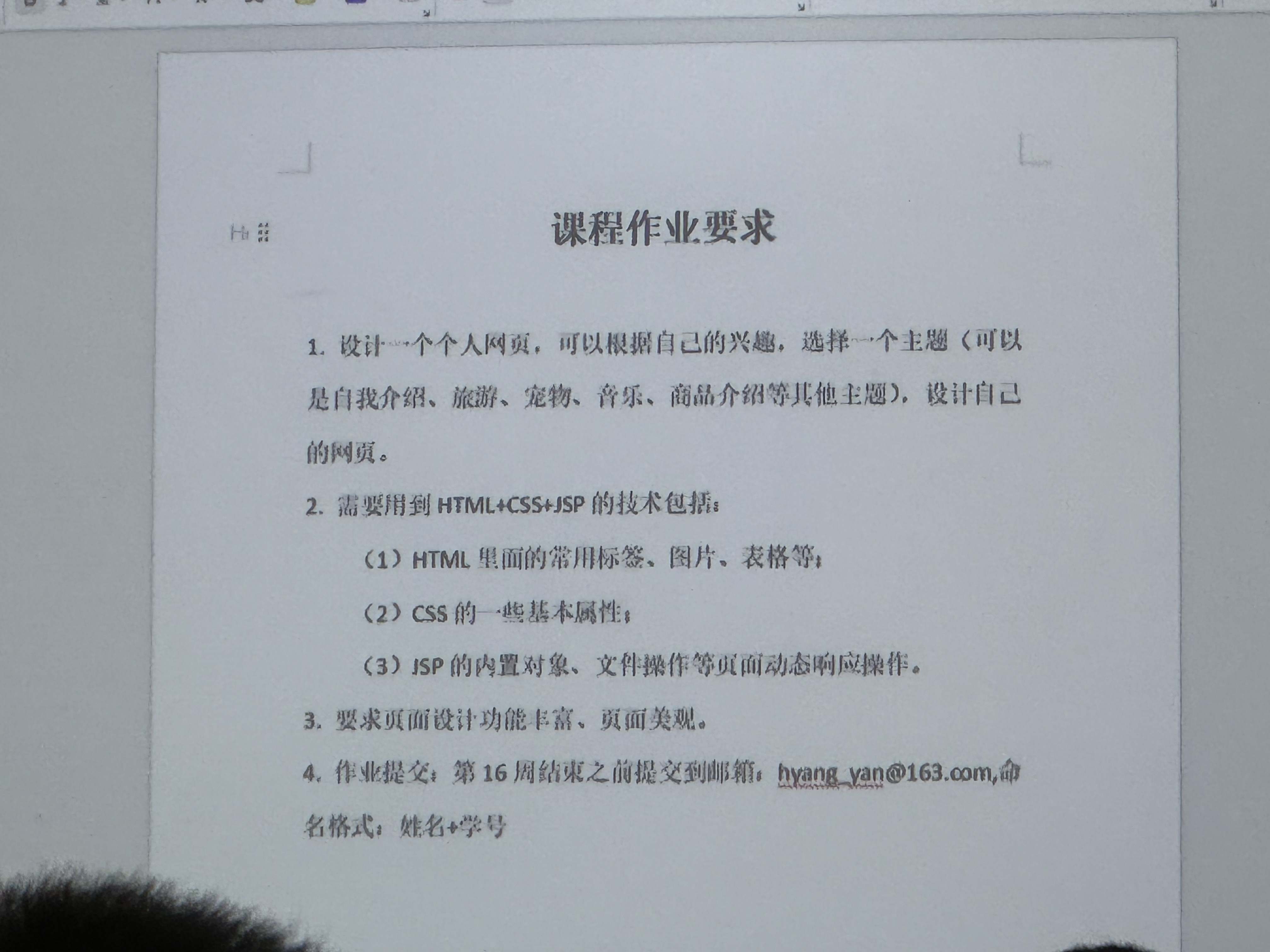
- 想做一个简单的工作室主页设计(在MasterGo上找到个模板)
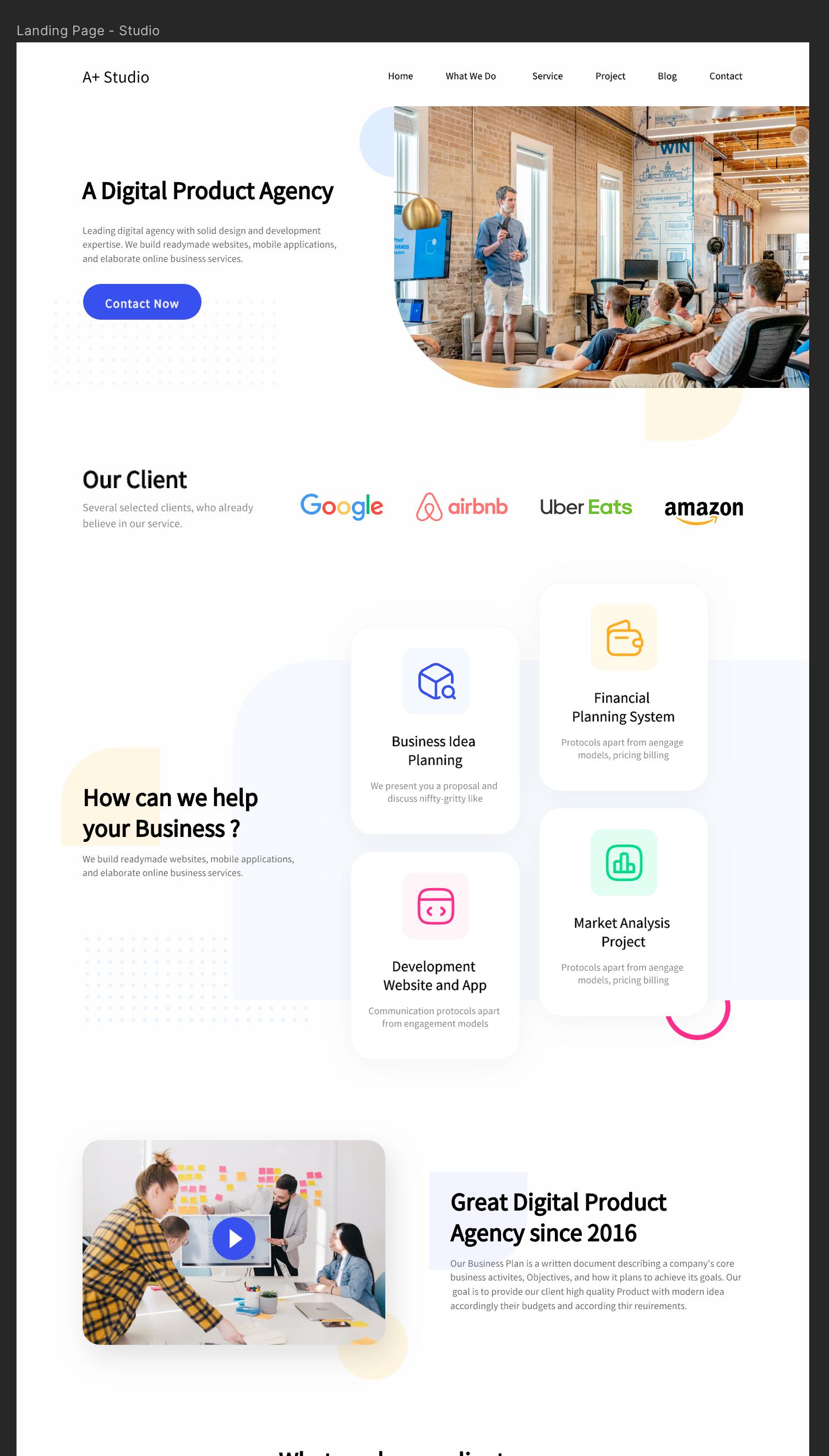
- https://mastergo.com/goto/AvNhjBqG?page_id=:27558&file=128583730325968 邀请您进入《工作室主页设计》,点击链接开始协作
二、技术栈选用
课程作业要求要使用HTML+CSS+JSP技术,在网上了解到JSP内可以套用Vue(相当于用Vue写模板,然后外面套一层JSP模板即可)。
最终决定使用Vue来实现前端,并且使用element Plus脚手架,后端部分尝试使用JSP(没学过,不知道能不能弄的下来),如果实在不行就用Django做前后端分离开发。
数据库方面的话,就用Mysql或者sqlite3。
三、项目初始化
1. 安装Vue.js和JSP和Tomcat
由于之前已经安装过Vue,所以不记录了。
JSP和Tomcat参考的是下面几篇文章,直接使用homebrew安装的:
值得注意的是以下启动 Tomcat方法
brew services start tomcat
如果终端提示 Successfully started 'tomcat' (label: homebrew.mxcl.tomcat) 则说明启动成功,浏览器访问 http://localhost:8080 即可看到 Tomcat 的页面。
2. 环境版本记录
- Vue.js: @vue/cli 5.0.8
- npm: 10.5.0
- Java: openjdk 22.0.1 2024-04-16/ OpenJDK Runtime Environment Temurin-22.0.1+8 (build 22.0.1+8)/ OpenJDK 64-Bit Server VM Temurin-22.0.1+8 (build 22.0.1+8, mixed mode)
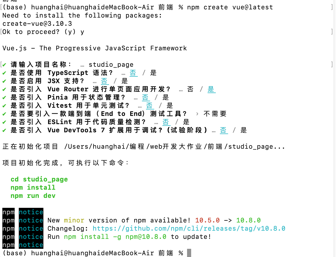
3. Vue项目创建
使用终端,进入想创建的文件夹位置,然后运行以下命令
npm create vue@latest
然后会让我输入项目名称和进行一些选项,在此我只选择了引入 Vue Router 进行单页面应用开发,其他选项均选择了否。
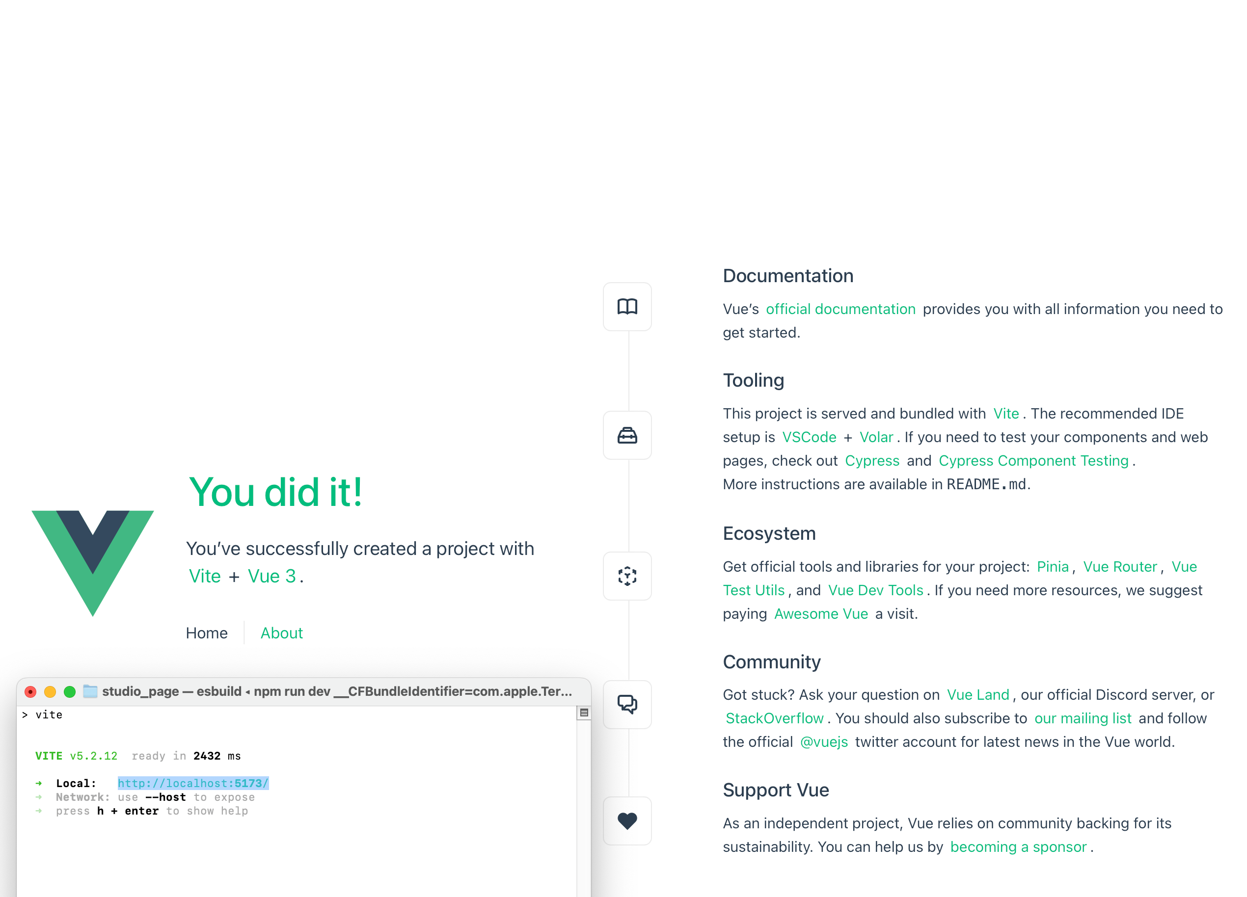
最后根据提示进入项目文件夹内,安装依赖并运行即可。
cd <your-project-name>
npm install #安装依赖
npm run dev #运行项目
在浏览器中打开对应网址即可
四、前端静态部分
1. 路由设置
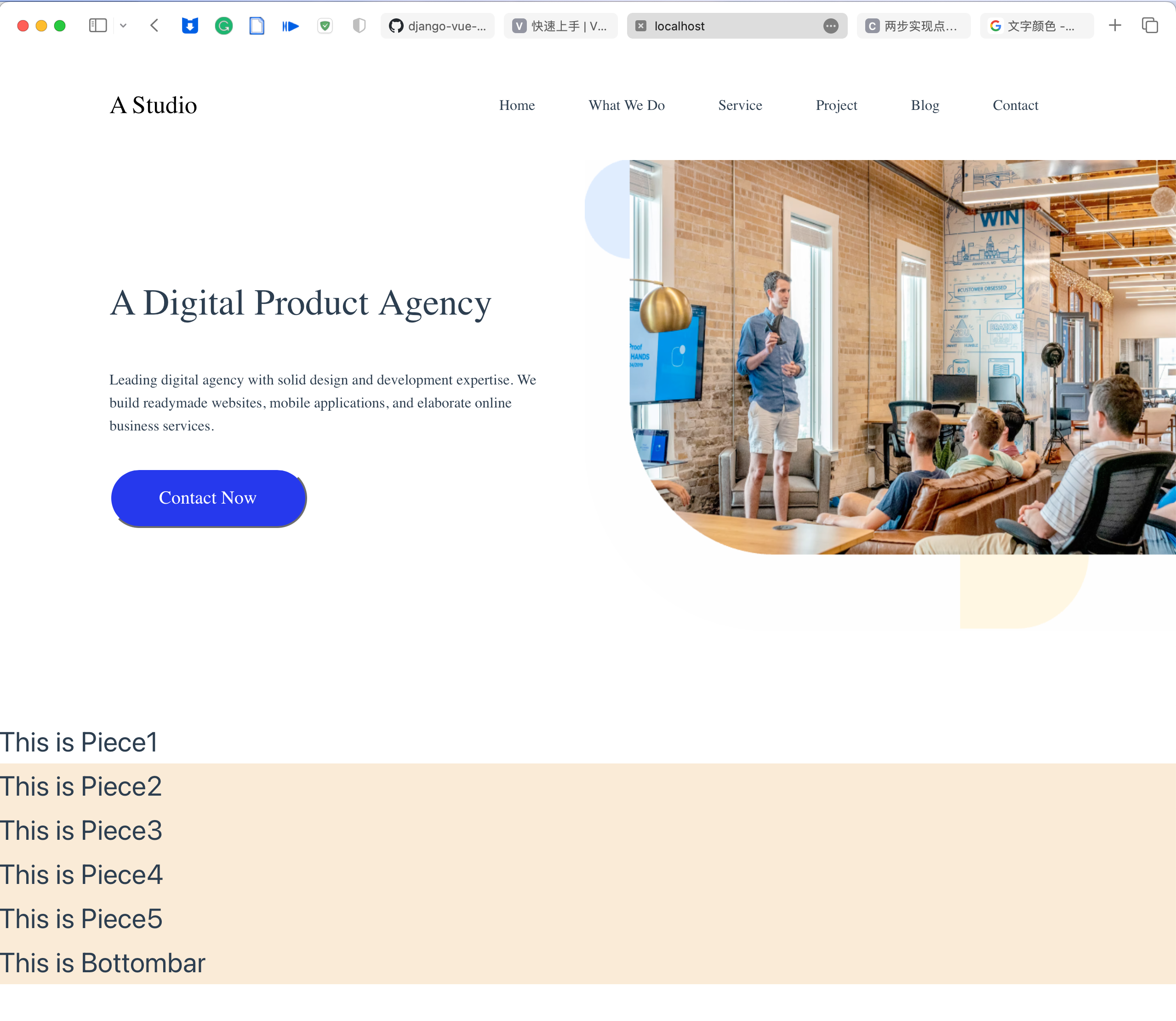
本项目是简单的项目,只有一个主页面,页面内由上到下排布多个块。
我们只需要修改src/App.vue和src/router/index.js中的内容,将一开始的页面指向自定义的文件src/components/home.vue即可,以下是具体内容:
<!-- App.vue -->
<script setup>
import { RouterLink, RouterView } from 'vue-router'
</script>

<template>
  <RouterView />
</template>
// index.js
import { createRouter, createWebHistory } from 'vue-router'
import home from '../components/home.vue'

const router = createRouter({
  history: createWebHistory(import.meta.env.BASE_URL),
  routes: [
    {
      path: '/',
      name: 'home',
      component: home
    },
  ]
})

export default router
<!-- home.vue -->
<template>
    <div>
        <h1>This is home</h1>
    </div>
  </template>
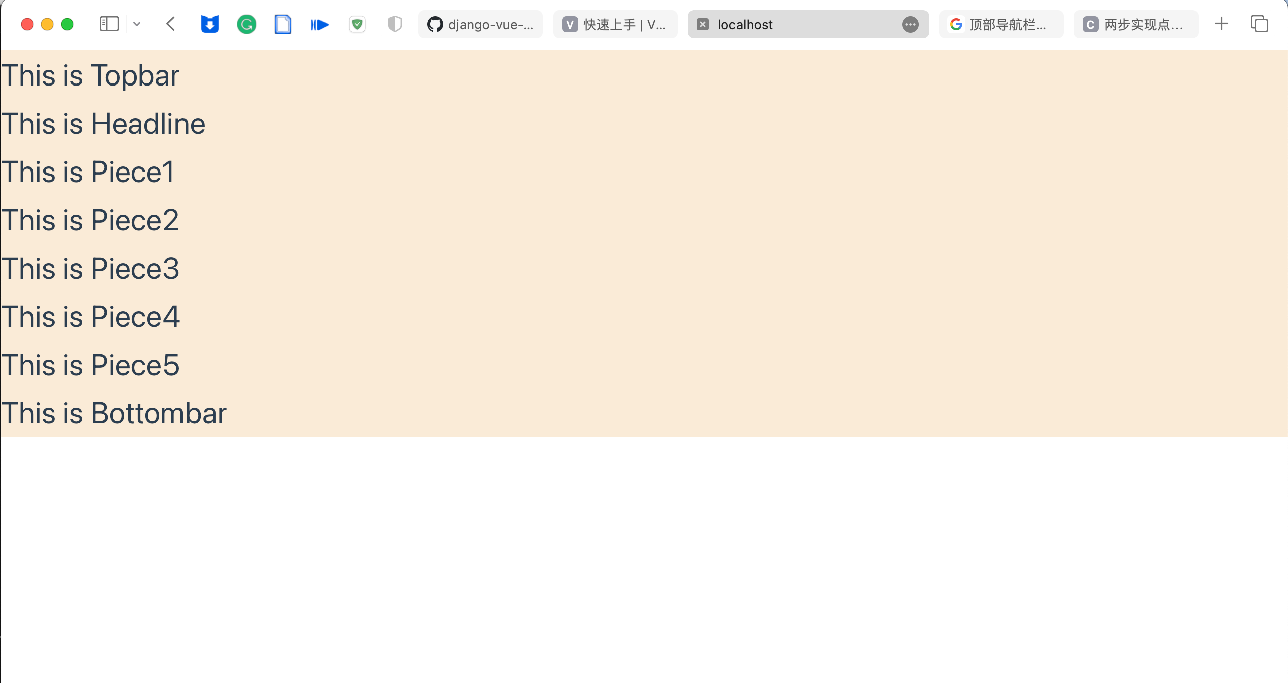
2. 主页的排版
根据UI图可以看出,主页是由多个部分组成,由上到下排布。
本项目中将每个部分分别写成一个组件文件,然后在home.vue中集成。
home.vue只需要关注组件部分间的排版即可。
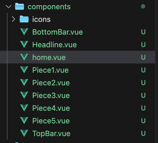
先分别创建好各个组件对应的文件:
然后修改home.vue
<template>
    <div class="main-page">
        <TopBar />
        <Headline />
        <Piece1 />
        <Piece2 />
        <Piece3 />
        <Piece4 />
        <Piece5 />
        <BottomBar />
    </div>
</template>

<script>
import TopBar from './TopBar.vue';
import Headline from './Headline.vue';
import Piece1 from './Piece1.vue';
import Piece2 from './Piece2.vue';
import Piece3 from './Piece3.vue';
import Piece4 from './Piece4.vue';
import Piece5 from './Piece5.vue';
import BottomBar from './BottomBar.vue';

export default {
    name: 'MainPage',
    components: {
        TopBar,
        Headline,
        Piece1,
        Piece2,
        Piece3,
        Piece4,
        Piece5,
        BottomBar
    }
};
</script>

<style scoped>
.main-page {
    display: flex;
    flex-direction: column;
    align-items: stretch;
    width: 100%;
    position: absolute;
    left: 0;
    right: 0;
    top: 0;
    bottom: 0;
    background-color: #ffffff;
}
</style>
最终得到效果如下:
接下来只需要在对应的组件文件中,完成前端的绘制即可。
3. 顶部菜单栏
首先看一下UI图,布局如下:

使用flex布局,红色部分使用space-between:两端对齐,项目之间的间隔都相等;蓝色部分使用space-around:每个项目两侧的间隔相等。
代码如下:
<template>
    <div class="bar">
        <div class="name">A Studio</div>
        <div class="label">
            <div>Home</div>
            <div>What We Do</div>
            <div>Service</div>
            <div>Project</div>
            <div>Blog</div>
            <div>Contact</div>
        </div>
    </div>
</template>

<style scoped>
.bar {
    display: flex;
    justify-content: space-between;
    margin-top: 42px;
    margin-left: 120px;
    margin-right: 120px;
}

.name {
    font-family: ProximaNova;
    font-size: 27.15px;
    font-weight: normal;
    line-height: 38px;
    letter-spacing: 0px;
    color: #000000;
}

.label{
    display: flex;
    justify-content: space-around;
    width: 645px;
    height: 20px;
    font-family: AvertaDemoPECuttedDemo;
    font-size: 16px;
    align-items: center;
    height: 100%;
}
</style>
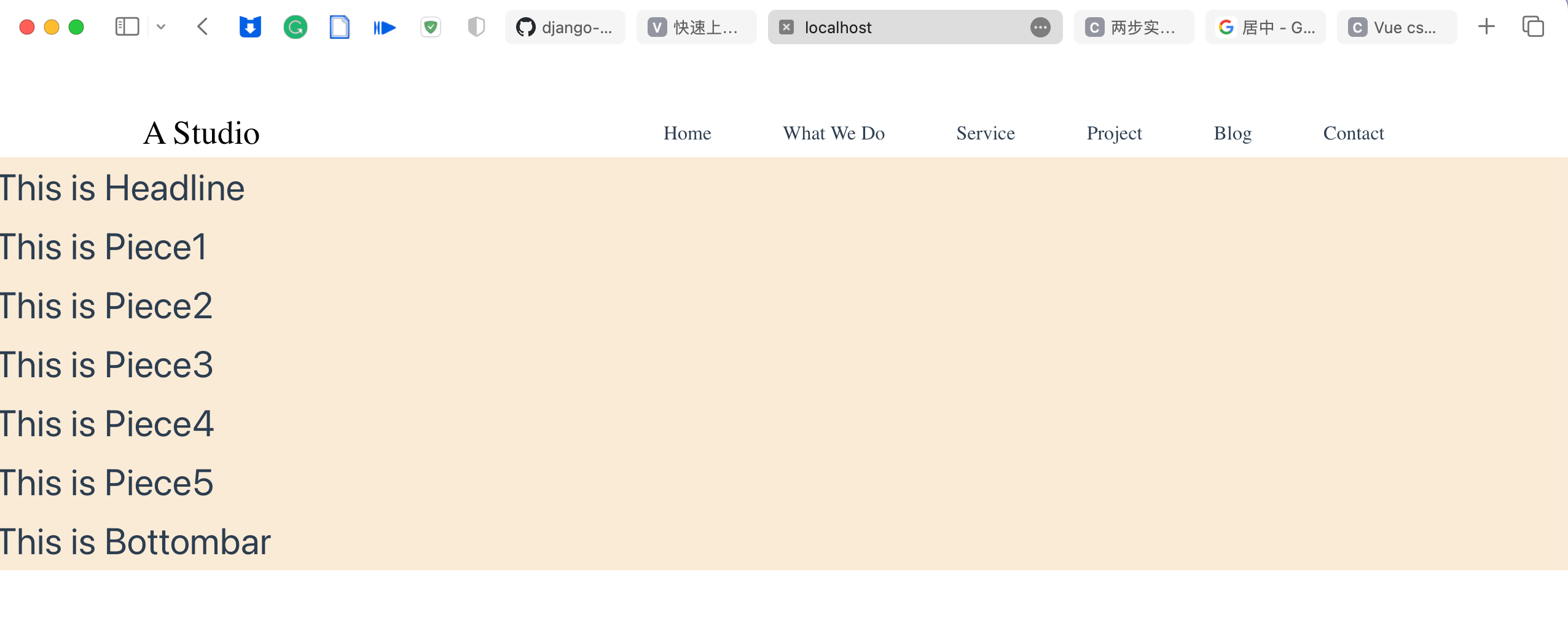
最终效果:
后续还需要做:
点击标签滚动到对应位置:参考文章
4. 头条部分
UI图:
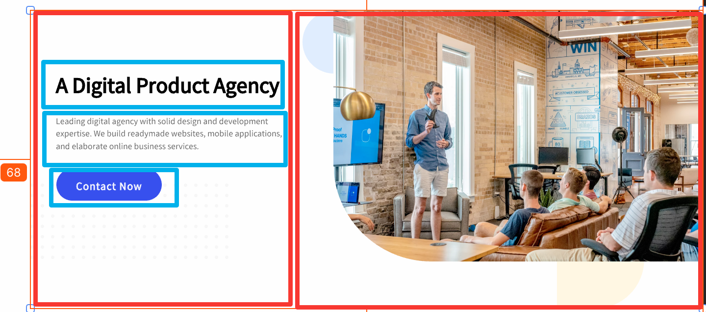
其中红色部分使用flex分为左右两部分,左边使用flex分为上下三部分,右边则是一张图。
代码如下:
<template>
    <div class="headline">
        <div class="left_part">
            <div class="text1">A Digital Product Agency</div>
            <div class="text2">Leading digital agency with solid design and development expertise. We build readymade
                websites, mobile applications, and elaborate online business services.</div>
            <button>Contact Now</button>
        </div>
        <div class="right_part">
            <img src="../assets/headimg.png" alt="">
        </div>
    </div>
</template>

<style scoped>
.headline {
    /* background-color: antiquewhite; */
    margin-top: 40px;
    margin-left: 68px;
    height: 608px;
    display: flex;
    justify-content: space-between;
}

.left_part {
    max-width: 40%;
    margin-left: 52px;
    margin-right: 32px;
    margin-top: 123px;
    display: flex;
    flex-direction: column;
    /* background-color: blue; */
}

.text1 {
    font-family: AvertaDemoPECuttedDemo;
    font-size: 40px;
}

.text2 {
    font-family: AvertaDemoPECuttedDemo;
    font-size: 16px;
    font-weight: normal;
    line-height: 25.6px;
    letter-spacing: 0px;
    margin-top: 40px;
}

.left_part button {
    display: flex;
    flex-direction: row;
    justify-content: center;
    align-items: center;
    margin-top: 33px;
    border-radius: 60px;
    background: #2639ED;
    font-size: 20px;
    font-family: AvertaDemoPECuttedDemo;
    color: white;
    width: 215px;
    height: 65px;
}

.right_part {
    max-width: 60%;
    overflow: hidden;
    /* background-color: red; */
}

.right_part img {
    height: 512px;
    max-width: 100%;
    border-radius: 0px 0px 0px 200px;
    /* margin-left: 64.5px;
    margin-bottom: 89px; */
}
</style>
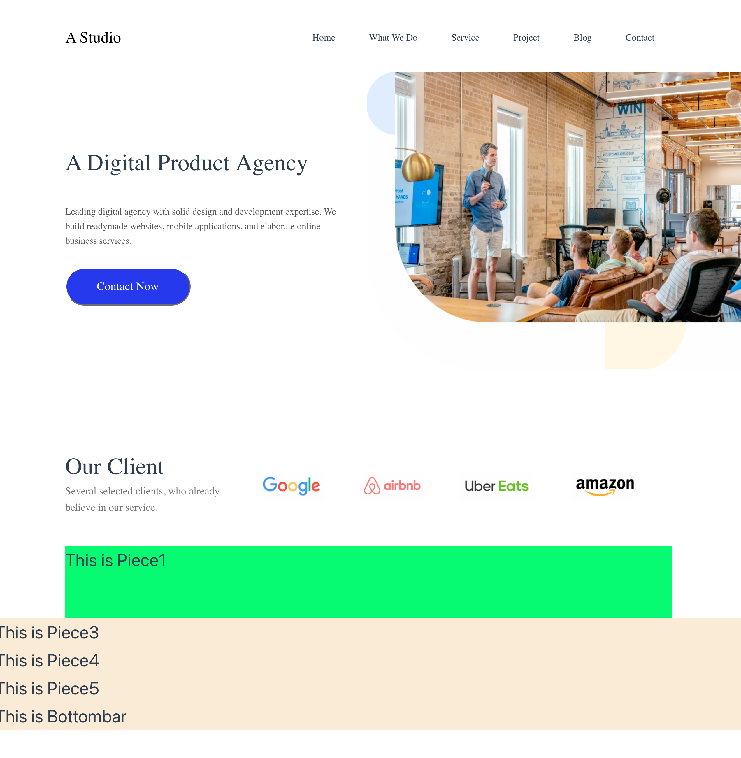
最终效果:
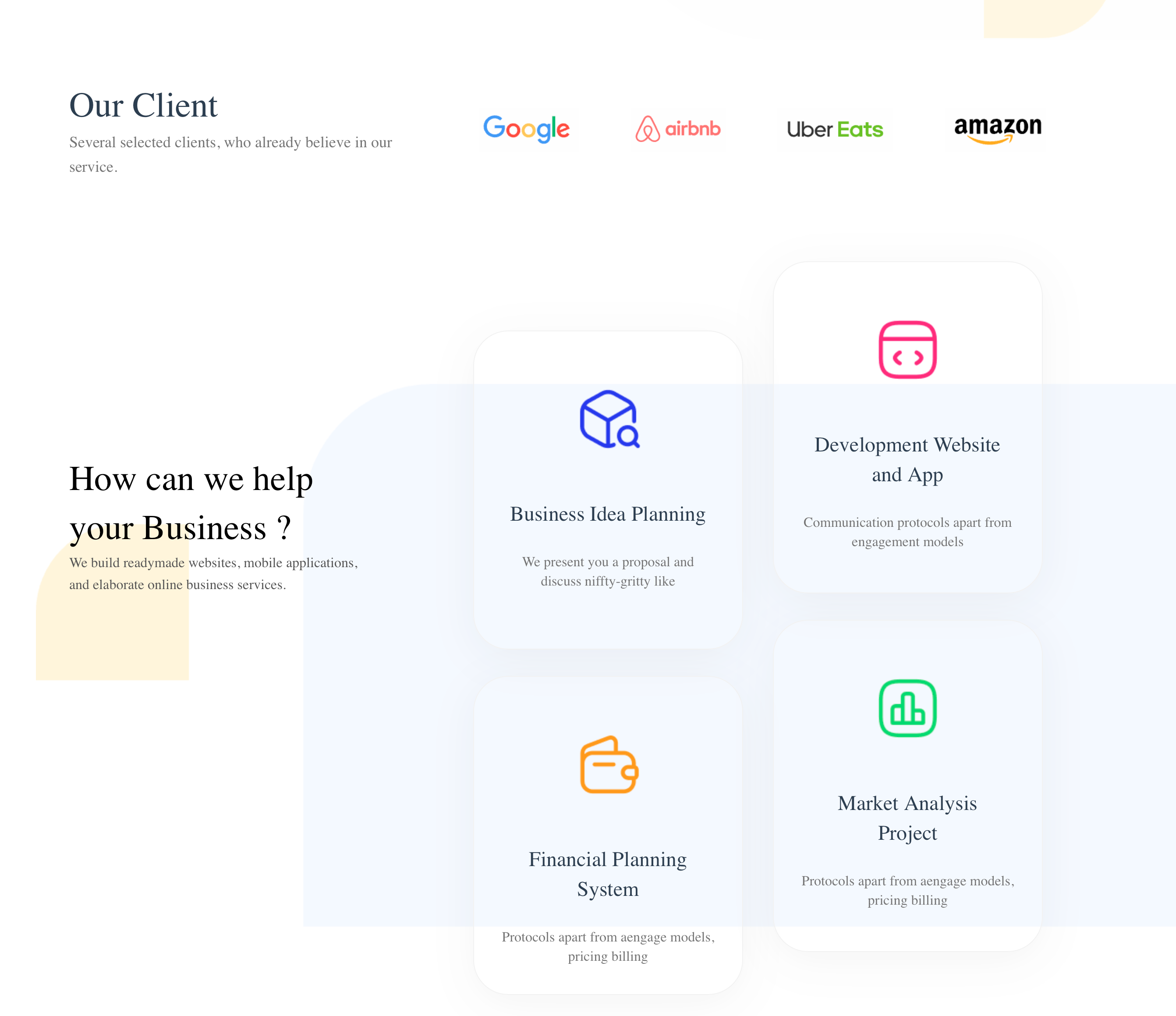
5. 块1
接下来是下面的五个块中的第一个。UI图如下:
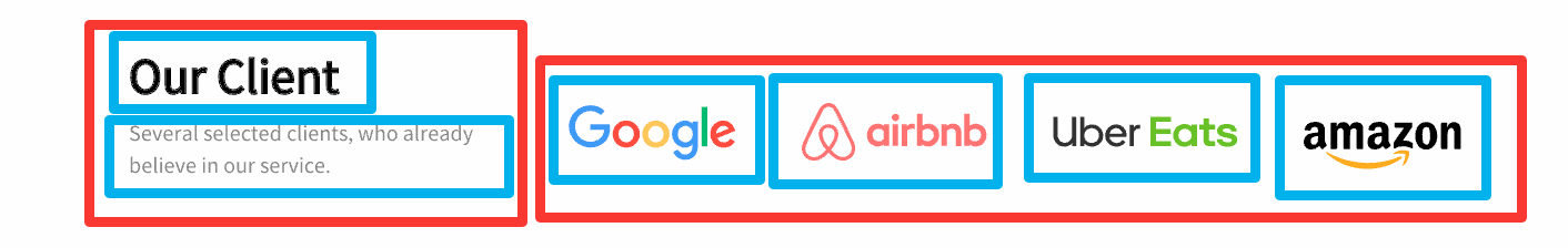
布局如图所示。
代码如下:
<template>
    <div class="piece">
        <div class="left_part">
            <div class="text1">Our Client</div>
            <div class="text2">Several selected clients, who already believe in our service.</div>
        </div>
        <div class="right_part">
            <img src="../assets/piece1_1.png" alt="">
            <img src="../assets/piece1_2.png" alt="">
            <img src="../assets/piece1_3.png" alt="">
            <img src="../assets/piece1_4.png" alt="">
        </div>
    </div>
</template>

<style scoped>
.piece {
    /* background-color: aqua; */
    display: flex;
    justify-content: space-between;
    margin-top: 40px;
    margin-right: 120px;
    margin-left: 120px;
    height: 124px;
}

.left_part {
    display: flex;
    flex-direction: column;
}

.text1 {
    font-family: AvertaDemoPECuttedDemo;
    font-size: 40px;
    font-weight: normal;
    line-height: 56px;
    letter-spacing: 0px;
}

.text2 {
    font-family: AvertaDemoPECuttedDemo;
    font-size: 18px;
    font-weight: normal;
    line-height: 28.8px;
    letter-spacing: 0px;
    color: #757575;
}

.right_part{
    display: flex;
    justify-content: space-between;
    margin-left: 40px;
    align-items: center;
}

.right_part img{
    height: 50px;
    margin-right: 59px;
}
</style>
效果如下:
- 遇到一个问题:布局的高度不是固定的(我在css里写了固定的数值),会随着浏览器的缩放而改变。暂未解决。
6. 块2
UI图如下:
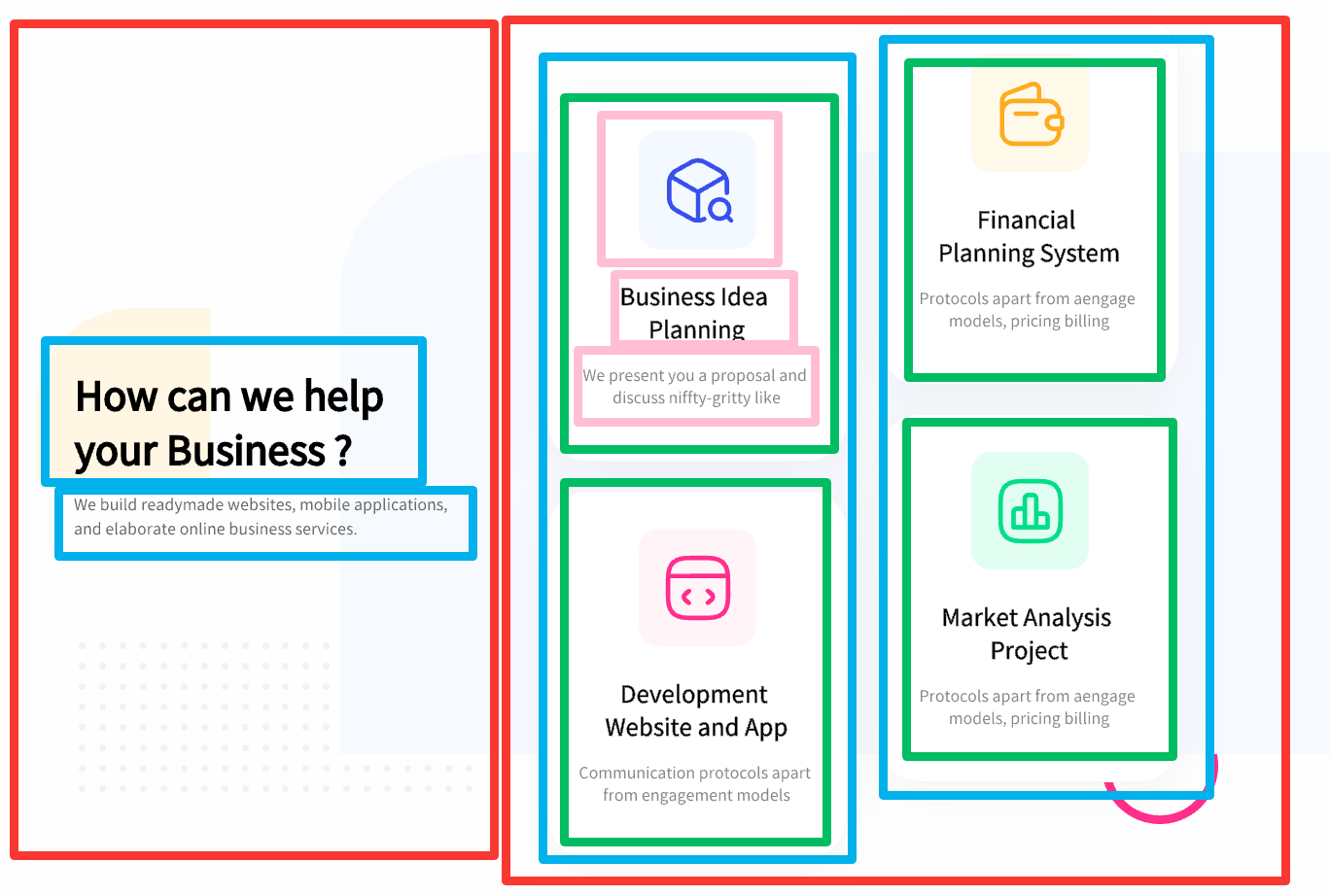
布局有点复杂,其中两个蓝色部分通过调整不同的margin-top来实现错位的效果。
背景的几个矩形不太好直接通过代码绘制,直接导出一张图片放在容器背景中。
代码如下:
<template>
    <div class="piece">
        <div class="left_part">
            <div class="text1">How can we help your Business ?</div>
            <div class="text2">We build readymade websites, mobile applications, and elaborate online business services.
            </div>
        </div>
        <div class="right_part">
            <div class="block_row" style="margin-top: 79px;">
                <div class="block">
                    <img src="../assets/piece2_1.png" alt="">
                    <div class="block_text1">Business Idea Planning</div>
                    <div class="block_text2">We present you a proposal and discuss niffty-gritty like</div>
                </div>
                <div class="block">
                    <img src="../assets/piece2_2.png" alt="">
                    <div class="block_text1">Financial Planning System</div>
                    <div class="block_text2">Protocols apart from aengage models, pricing billing</div>
                </div>
            </div>
            <div class="block_row">
                <div class="block">
                    <img src="../assets/piece2_3.png" alt="">
                    <div class="block_text1">Development Website and App</div>
                    <div class="block_text2">Communication protocols apart from engagement models</div>
                </div>
                <div class="block">
                    <img src="../assets/piece2_4.png" alt="">
                    <div class="block_text1">Market Analysis Project</div>
                    <div class="block_text2">Protocols apart from aengage models, pricing billing</div>
                </div>
            </div>
        </div>
    </div>
</template>

<style scoped>
.piece {
    /* background-color:rgb(0, 255, 115); */
    display: flex;
    justify-content: space-between;
    margin-top: 94px;
    margin-left: 82px;
    height: 867px;
    background-image: url('../assets/piece2_background.png');
    background-size: 100% 100%;
            background-repeat: no-repeat;
}

.left_part {
    /* background-color: aquamarine; */
    display: flex;
    flex-direction: column;
    max-width: 358px;
    margin-left: 38px;
    margin-right: 91px;
    margin-top: 220px;
}

.right_part {
    /* background-color: rebeccapurple; */
    display: flex;
    justify-content: space-around;
    margin-right: 183px;
}

.text1 {
    font-family: AvertaDemoPECuttedDemo;
    font-size: 40px;
    font-weight: normal;
    line-height: 56px;
    letter-spacing: 0px;

    color: #000000;
}

.text2 {
    font-family: AvertaDemoPECuttedDemo;
    font-size: 16px;
    font-weight: normal;
    line-height: 25.6px;
    letter-spacing: 0px;

    color: #565656;
}

.block_row {
    /* background-color: bisque; */
    display: flex;
    flex-direction: column;
    margin-left: 34px;
}

.block {
    /* background-color: #000000; */
    display: flex;
    height: 379px;
    width: 308px;
    margin-bottom: 30px;
    flex-direction: column;
    align-items: center;

    box-sizing: border-box;
    border: 1px solid #F2F2F2;
    border-radius: 40px;
    box-shadow: 0px 10px 50px 0px rgba(0, 0, 0, 0.05);
}

.block img {
    margin-top: 63px;
}

.block_text1 {
    font-family: AvertaDemoPECuttedDemo;
    font-size: 24px;
    font-weight: normal;
    line-height: 34px;
    text-align: center;
    letter-spacing: 0px;

    margin-top: 54px;
    margin-left: 38px;
    margin-right: 38px;
}

.block_text2 {
    font-family: AvertaDemoPECuttedDemo;
    font-size: 16px;
    font-weight: normal;
    line-height: 22.4px;
    text-align: center;
    letter-spacing: 0px;

    color: #757575;

    margin-top: 27px;
    margin-left: 31px;
    margin-right: 31px;
}
</style>
效果如下:
实践中发现,使用背景图片来实现那些矩形,有点难以控制,效果不佳。最终我简化了一些元素,勉强能看。
如果要达到最好的效果,还是得通过代码实现矩形的绘制。
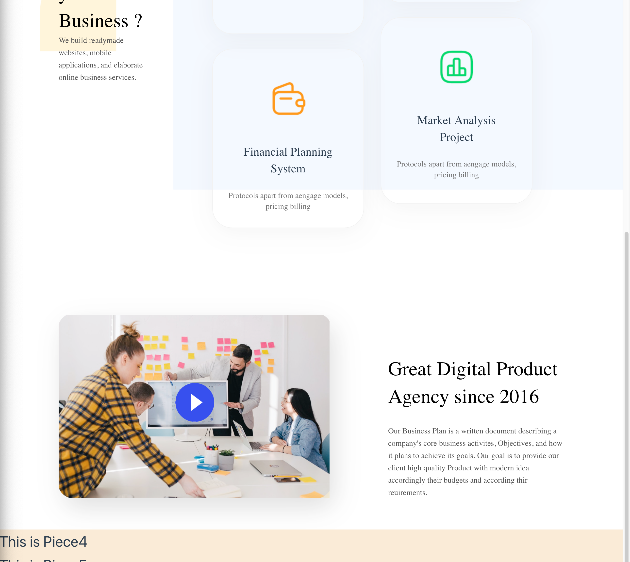
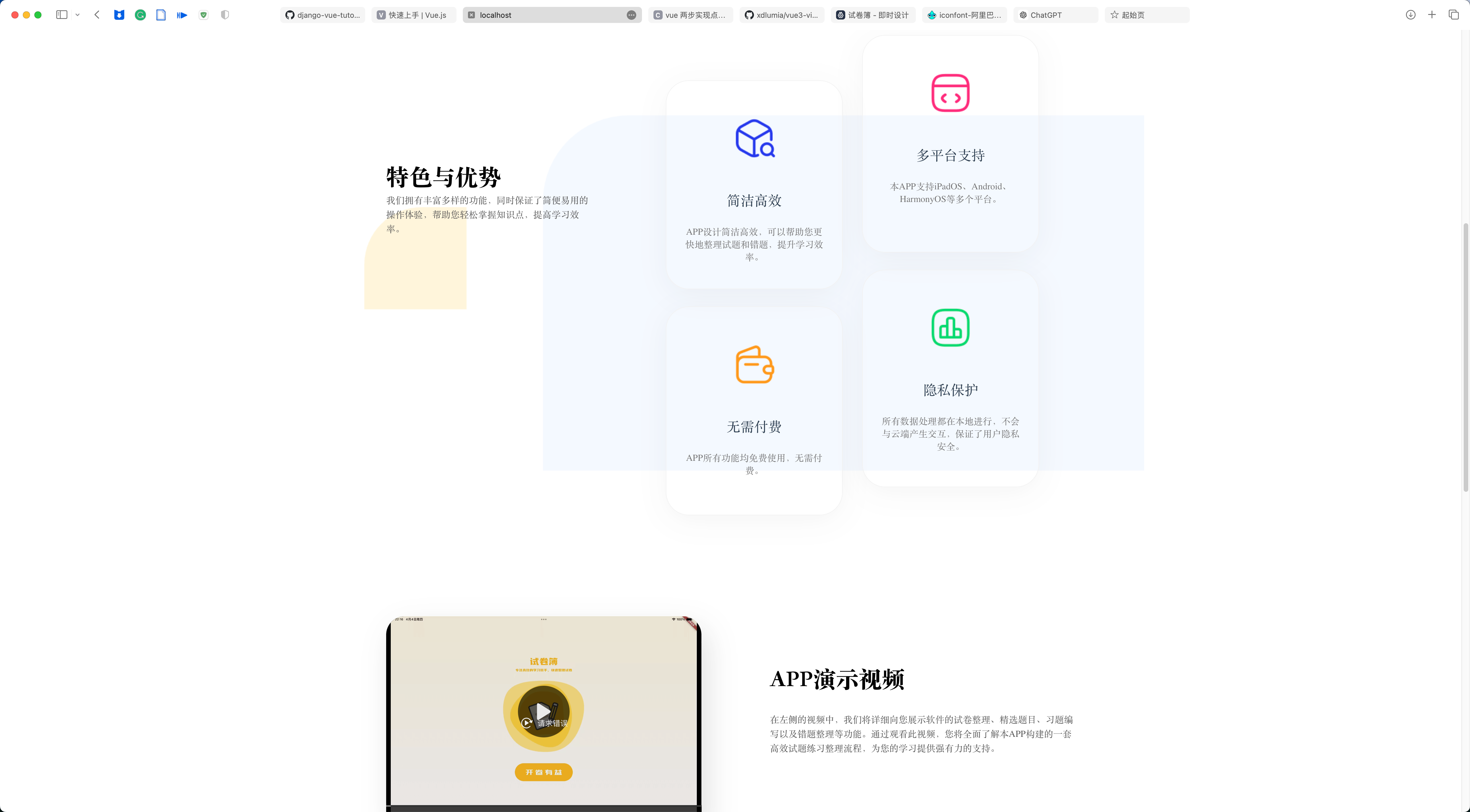
7. 块3
UI图:
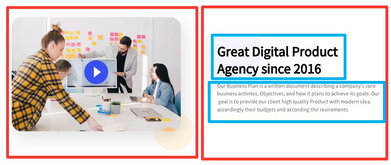
这里的布局比较简单,就不过多赘述了。
7.1 视频播放器
比较特别的是此处使用了一个视频播放器,但是目前暂时没有实现,出现了一些bug:第三方的播放器插件安装后import显示找不到,传统的video播放不了……
先使用img代替,后续再修这个bug。
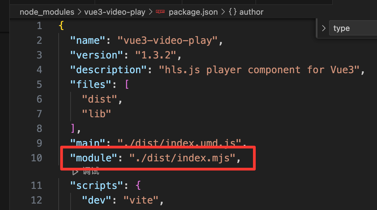
选用vue3VideoPlay这个插件,值得注意的是,这个插件有一个问题,其默认package.json中有一个路径是错的,要改写成下面这个:
另外,该插件官方的文档也有点问题,mp4文件不知道为什么播放不了,本地文件也播放不了……
经过测试,网络m3u8文件可以播放,所以下面使用此格式进行播放。(如何获得m3u8链接,写在了补充部分)
代码:
- template部分:
<div class="left_part">
    <!-- <img src="../assets/piece3.png" alt=""> -->
    <vue3VideoPlay width="100%" height="100%"
        poster="https://cdn.jsdelivr.net/gh/xdlumia/files/video-play/ironMan.jpg" :src="options.src"
        :type="options.type" :autoPlay="false" />
</div>
此处值得注意的部分是,播放器的长和宽得像代码的写法才有效,写成css无效,另外,圆角也只能通过设置父容器overflow: hidden;实现。
poster部分是封面。
- script部分:
<script setup lang="ts">
import { reactive } from "vue";
const options = reactive({
    src: "https://test-streams.mux.dev/x36xhzz/x36xhzz.m3u8", //视频源
    type: "m3u8", //视频类型
});
</script>
7.2 布局代码
代码:
<template>
    <div class="piece">
        <div class="left_part">
                <img src="../assets/piece3.png" alt="">
                <!-- <VideoPlayer videoSrc="../assets/cockatoo.mp4" coverSrc="../assets/piece1_1.png" /> -->
        </div>
        <div class="right_part">
            <div class="text1">Great Digital Product Agency since 2016 </div>
            <div class="text2">Our Business Plan is a written document describing a company's core business activites,
                Objectives, and how it plans to achieve its goals. Our goal is to provide our client high quality
                Product with modern idea accordingly their budgets and according thir reuirements.</div>
        </div>
    </div>
</template>

<script>
import VideoPlayer from './videoplayer.vue';

export default {
    name: 'App',
    components: {
        VideoPlayer
    }
};
</script>

<style scoped>
.piece {
    /* background-color: aqua; */
    display: flex;
    justify-content: space-between;
    margin-top: 146px;
    margin-left: 120px;
    margin-right: 120px;
    height: 436px;
}

.left_part {
    width: 550px;
    height: 372px;
    /* background-color: bisque; */
    box-shadow: 10px 20px 50px 0px rgba(0, 0, 0, 0.15);
    border-radius: 32px;
}

.left_part img {
    /* width: 100%;
    height: 100%; */
    width: 550px;
    height: 372px;
    object-fit: cover;
    /* 使图片覆盖整个容器 */
    object-position: center;
    /* 居中显示图片 */
}

.right_part {
    display: flex;
    flex-direction: column;
    width: 532px;
    max-width: 550px;
    margin-left: 119px;
}

.text1 {
    margin-top: 82px;
    font-family: AvertaDemoPECuttedDemo;
    font-size: 40px;
    font-weight: normal;
    line-height: 56px;
    letter-spacing: 0px;

    color: #000000;
}

.text2 {
    margin-top: 30px;
    margin-bottom: 122px;
    font-family: AvertaDemoPECuttedDemo;
    font-size: 16px;
    font-weight: normal;
    line-height: 25.6px;
    letter-spacing: 0px;

    color: #565656;
}
</style>
效果:
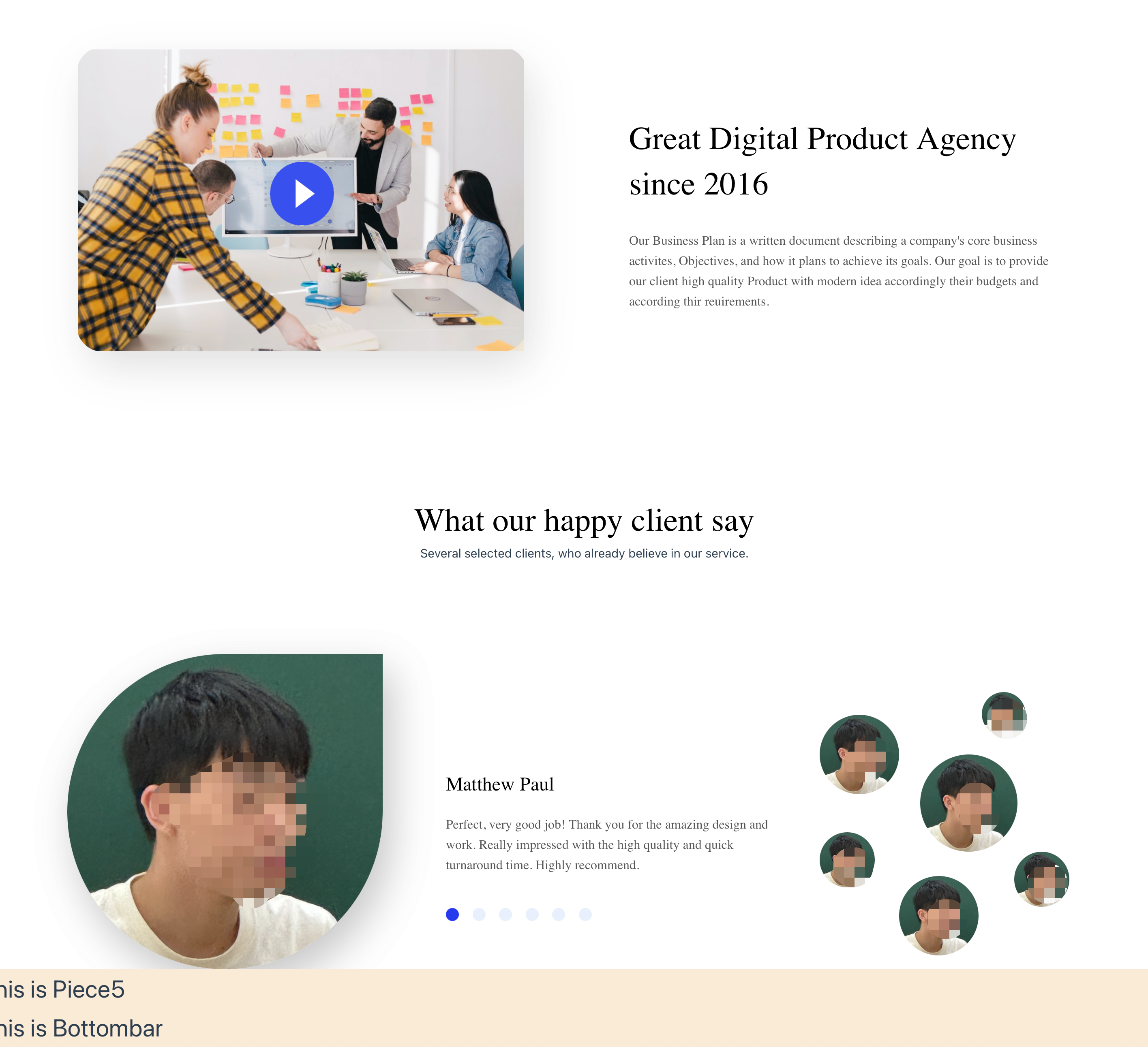
8. 块4
UI图: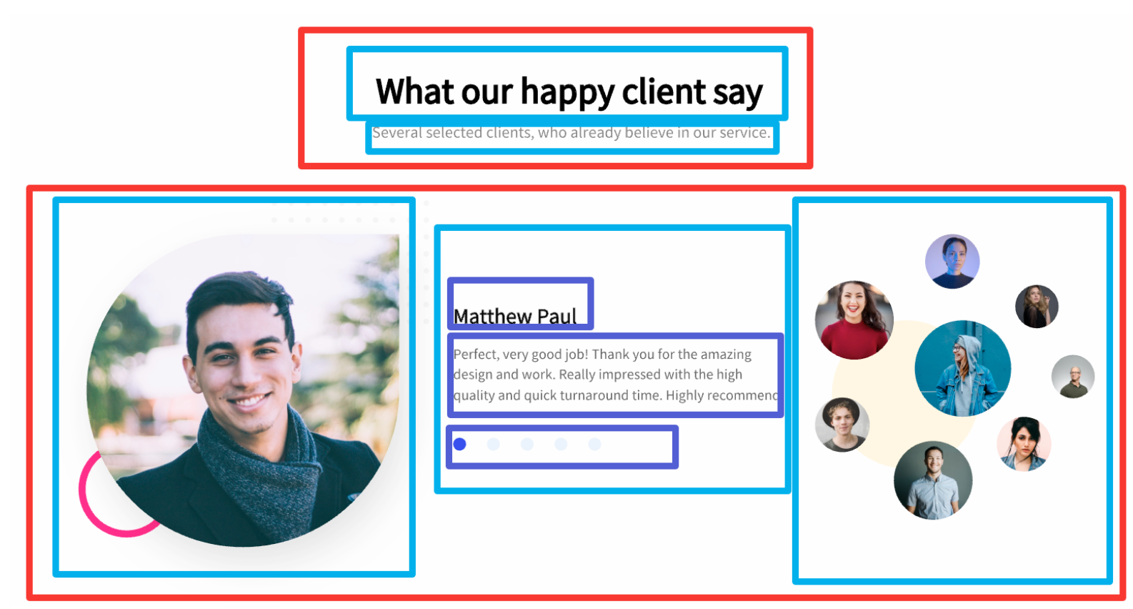
这张图是有动效的,中间的蓝色圆圈可以选择不同的人物介绍。
在此先做好静态的外观,动效后面再补全。
8.1 静态布局
代码如下:
<template>
    <div class="piece">
        <div class="top_part">
            <div class="top_text1">What our happy client say</div>
            <div class="top_2text2">Several selected clients, who already believe in our service.</div>
        </div>
        <div class="bottom_part">
            <div class="bottom_1">
                <img src="../assets/piece4.png" alt="">
            </div>
            <div class="bottom_2">
                <div class="bottom_text1">Matthew Paul</div>
                <div class="bottom_text2">Perfect, very good job! Thank you for the amazing design and work. Really
                    impressed with the high quality and quick turnaround time. Highly recommend.</div>
                <div class="select">
                    <div class="option" style="background: #2639ED;"></div>
                    <div class="option"></div>
                    <div class="option"></div>
                    <div class="option"></div>
                    <div class="option"></div>
                    <div class="option"></div>
                </div>
            </div>
            <div class="bottom_3">
                <img src="../assets/piece4.png" alt="" class="img120">
                <img src="../assets/piece4.png" alt="" class="img98" style="left: 0px;top: 58px;">
                <img src="../assets/piece4.png" alt="" class="img98" style="left: 98px;top: 257px;">
                <img src="../assets/piece4.png" alt="" class="img68" style="left: 0px;top: 203px;">
                <img src="../assets/piece4.png" alt="" class="img68" style="left: 240px;top: 227px;">
                <img src="../assets/piece4.png" alt="" class="img54">
            </div>
        </div>
    </div>
</template>

<style scoped>
.piece {
    /* background-color: aqua; */
    display: flex;
    flex-direction: column;
    align-items: center;
    height: 597px;
    margin-top: 117px;
    margin-left: 107px;
    margin-right: 69px;
}

.top_part {
    display: flex;
    flex-direction: column;
    align-items: center;
}

.top_text1 {
    font-family: AvertaDemoPECuttedDemo;
    font-size: 40px;
    font-weight: normal;
    line-height: 56px;
    text-align: center;
    letter-spacing: 0px;

    color: #000000;
}

.top_text2 {
    margin-top: 17px;
    font-family: AvertaDemoPECuttedDemo;
    font-size: 18px;
    font-weight: normal;
    line-height: 28.8px;
    text-align: center;
    letter-spacing: 0px;

    color: #757575;
}

.bottom_part {
    margin-top: 113px;
    display: flex;
    justify-content: space-between;
    height: 389px;
    align-items: center;
    width: 100%;
}

.bottom_1 {
    box-shadow: 10px 20px 50px 0px rgba(0, 0, 0, 0.15);
    border-radius: 500px 0px 500px 500px;
    width: 389px;
    height: 389px;
}

.bottom_1 img {
    width: 100%;
    height: 100%;
    box-shadow: 10px 20px 50px 0px rgba(0, 0, 0, 0.15);
    border-radius: 500px 0px 500px 500px;
}

.bottom_2 {
    display: flex;
    flex-direction: column;
    margin-left: 67px;
    margin-top: 84px;
    width: 412px;
    max-width: 600px;
}

.bottom_text1 {
    font-family: AvertaDemoPECuttedDemo;
    font-size: 24px;
    font-weight: normal;
    line-height: 34px;
    text-align: left;
    letter-spacing: 0px;

    color: #000000;
}

.bottom_text2 {
    font-family: AvertaDemoPECuttedDemo;
    font-size: 16px;
    font-weight: normal;
    line-height: 25.6px;
    letter-spacing: 0px;
    margin-top: 21px;
    color: #565656;
}

.bottom_3 {
    position: relative;
    width: 348px;
    height: 355px;
    margin-left: 38px;
}

.img120 {
    border-radius: 500px 500px 500px 500px;
    position: absolute;
    left: 124px;
    top: 107px;
    width: 120px;
    height: 120px;
    opacity: 1;
}

.img98 {
    border-radius: 500px 500px 500px 500px;
    position: absolute;
    width: 98px;
    height: 98px;
    opacity: 1;
}

.img68 {
    border-radius: 500px 500px 500px 500px;
    position: absolute;
    width: 68px;
    height: 68px;
    opacity: 1;

}

.img54 {
    border-radius: 500px 500px 500px 500px;
    position: absolute;
    left: 200px;
    top: 30px;
    width: 54px;
    height: 54px;
    opacity: 1;
}

.select{
    display: flex;
    justify-content: space-between;
    margin-top: 40px;
    width: 180px;
}

.option{
    border-radius: 500px 500px 500px 500px;
    width: 16px;
    height: 16px;
    background: #E7F0FC;
}
</style>
事实上,这里的图片和选项都写法,复用性很差,而且不好做动效。后面会使用v-for等方法进行修改。
效果如下(因为没有找到合适的图片,就随便拿了一张图片):
9. 块5
UI如下图:
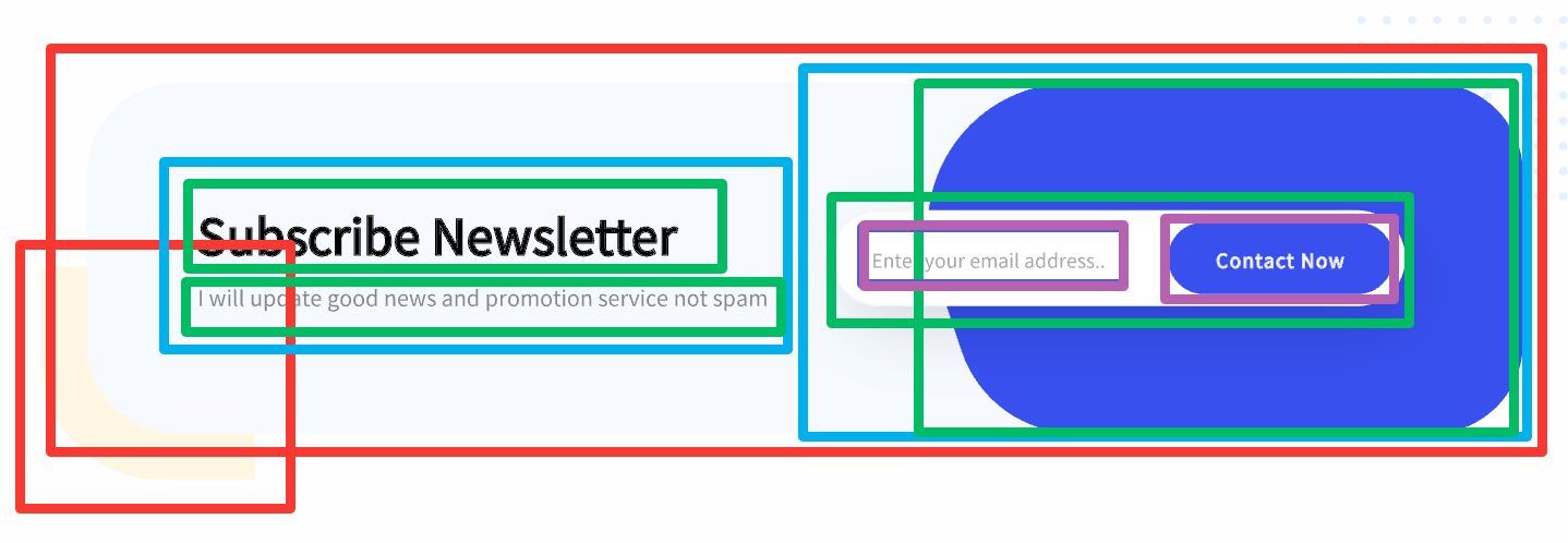
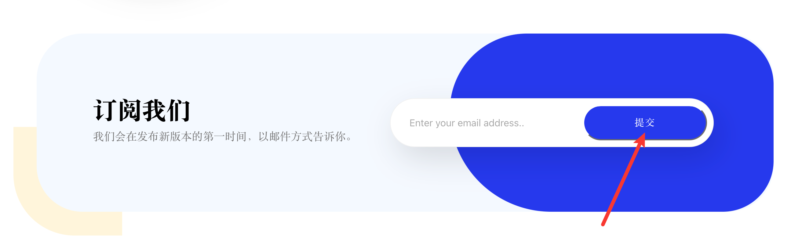
这一部分的布局和上面的有许多不同,有一部分的布局不能使用flex实现,得用相对和绝对位置relative、absolute来实现重叠,如图中的红色、右边的绿色部分。
具体代码如下:
<template>
    <div class="a">
        <div class="piece">
            <div class="rectangle"></div>
            <div class="main">
                <div class="left_part">
                    <div class="text1">Subscribe Newsletter</div>
                    <div class="text2">I will update good news and promotion service not spam</div>
                </div>
                <div class="right_part">
                    <div class="back"></div>
                    <div class="input">
                        <input type="text" placeholder="Enter your email address..">
                        <button>Contact Now</button>
                    </div>
                </div>
            </div>
        </div>
    </div>
</template>

<style scoped>
.piece {
    /* background-color: aqua; */
    position: relative;
    margin-top: 92px;
    margin-left: 82px;
    margin-right: 86px;
    height: 387px;
}

.main {
    position: absolute;
    display: flex;
    justify-content: space-between;
    left: 38px;
    top: 0px;
    border-radius: 75px;
    opacity: 1;
    width: 97%;
    /* max-width: 100%; */
    height: 292px;
    background-color: #F4F9FF;
}

.rectangle {
    position: absolute;
    left: 0px;
    top: 153px;
    width: 178px;
    height: 178px;
    transform: rotate(90deg);
    border-radius: 0px 0px 100px 0px;
    opacity: 1;

    background: #FFF5DB;
}

.left_part {
    display: flex;
    flex-direction: column;
    margin-left: 92px;
    margin-top: 98px;
    width: 40%;
}

.text1 {
    font-family: AvertaDemoPECuttedDemo;
    font-size: 40px;
    font-weight: normal;
    line-height: 56px;
    letter-spacing: 0px;

    color: #000000;
}

.text2 {
    font-family: AvertaDemoPECuttedDemo;
    font-size: 18px;
    font-weight: normal;
    line-height: 28.8px;
    letter-spacing: 0px;

    color: #757575;
}

.right_part {
    position: relative;
    width: 60%;
    margin-left: 10px;
}

.back {
    position: absolute;
    right: 0px;
    top: 0px;
    width: 80%;
    height: 292px;
    opacity: 1;
    border-radius: 380px 250px 250px 500px;
    background: #2639ED;
}

.input {
    position: absolute;
    right: 98px;
    top: 106px;
    width: 80%;
    height: 80px;
    border-radius: 60px;
    opacity: 1;

    box-sizing: border-box;
    border: 1px solid #F1F1F1;
    box-shadow: 10px 20px 50px 0px rgba(0, 0, 0, 0.15);
    background-color: white;

    display: flex;
    justify-content: space-between;
}

.input button {
    border-radius: 60px;
    margin-top: 10px;
    margin-bottom: 10px;
    margin-right: 10px;
    width: 39.2%;
    background: #2639ED;

    font-family: AvertaDemoPECuttedDemo;
    font-size: 16px;
    font-weight: normal;
    line-height: 22px;
    letter-spacing: 1.04px;

    color: #FFFFFF;
}

.input input {
    border: none;
    /* 移除边框 */
    outline: none;
    /* 移除聚焦时的外边框 */
    width: 55%;
    border-radius: 60px;
    margin-left: 30px;
    font-size: 16px;
}
</style>
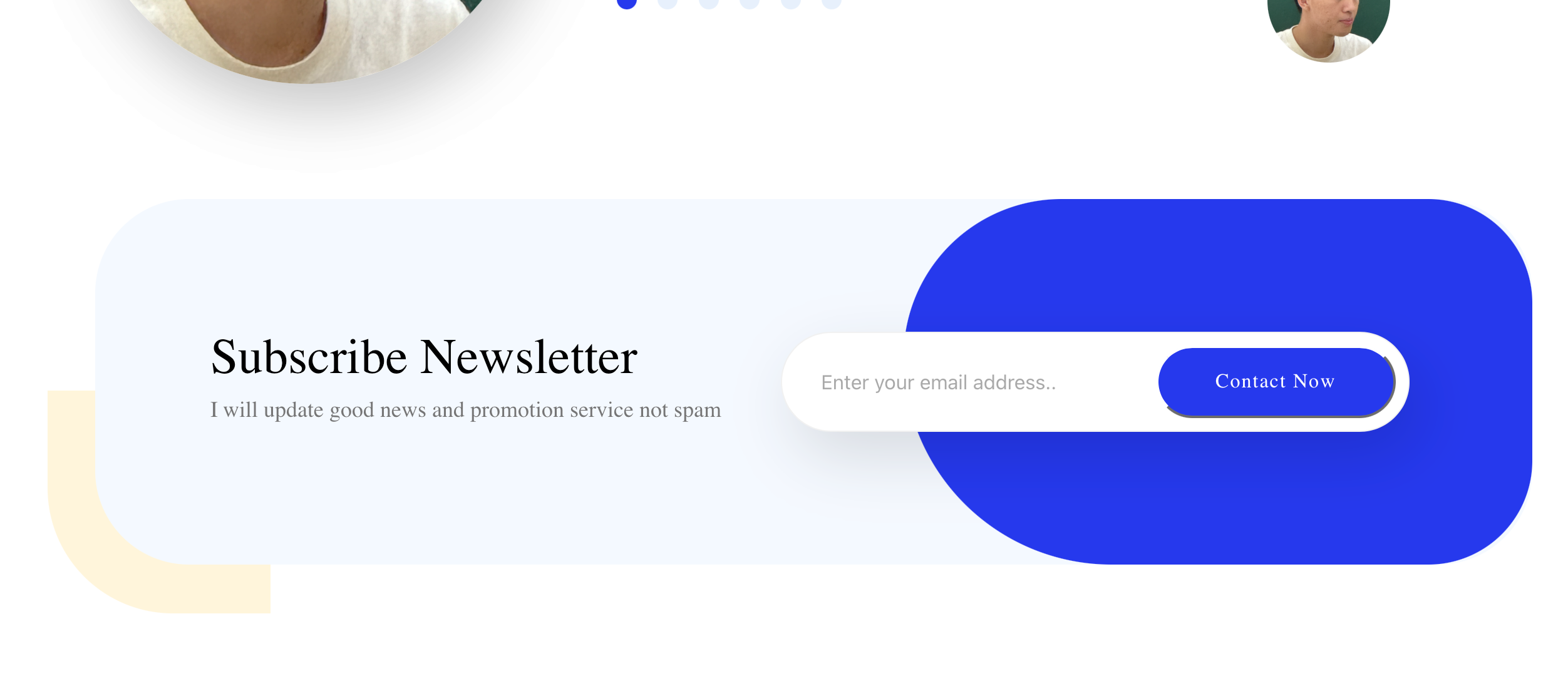
效果如下:
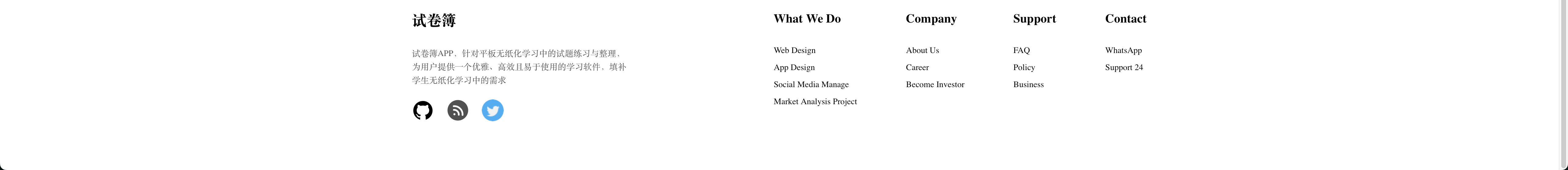
10. 底部
UI如下:
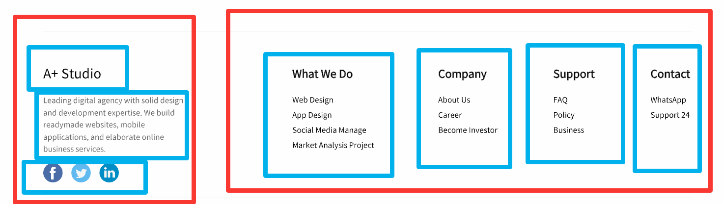
布局比较简单,就不过多赘述。
代码如下:
<template>
    <div class="bottombar">
        <div class="left_part">
            <div class="left_text1">A+ Studio</div>
            <div class="left_text2">Leading digital agency with solid design and development expertise. We build
                readymade websites, mobile applications, and elaborate online business services.</div>
            <div class="left_bottom">
                <img src="../assets/piece4.png" alt="">
                <img src="../assets/piece4.png" alt="">
                <img src="../assets/piece4.png" alt="">
            </div>
        </div>
        <div class="right_part">
            <div class="block">
                <div class="block_title">What We Do</div>
                <div class="block_items">
                    <div class="itme_text">Web Design
                        <br>App Design
                        <br>Social Media Manage
                        <br>Market Analysis Project</div>
                </div>
            </div>
            <div class="block">
                <div class="block_title">Company</div>
                <div class="block_items">
                    <div class="itme_text">About Us
                        <br>Career
                        <br>Become Investor</div>
                </div>
            </div>
            <div class="block">
                <div class="block_title">Support</div>
                <div class="block_items">
                    <div class="itme_text">FAQ
                        <br>Policy
                        <br>Business</div>
                </div>
            </div>
            <div class="block">
                <div class="block_title">Contact</div>
                <div class="block_items">
                    <div class="itme_text">WhatsApp
                        <br>Support 24</div>
                </div>
            </div>
        </div>
    </div>
</template>

<style scoped>
.bottombar {
    margin-top: 107px;
    margin-left: 120px;
    margin-right: 120px;
    margin-bottom: 100px;
    display: flex;
    justify-content: space-between;
}

.left_part {
    display: flex;
    flex-direction: column;
    margin-top: 60px;
    max-width: 30%;
}

.left_text1 {
    font-family: ProximaNova;
    font-size: 24px;
    font-weight: normal;
    line-height: 34px;
    letter-spacing: 0px;

    color: #000000;

}

.left_text2 {
    margin-top: 26px;
    font-family: AvertaDemoPECuttedDemo;
    font-size: 14px;
    font-weight: normal;
    line-height: 22.4px;
    letter-spacing: 0px;

    color: #565656;
}

.left_bottom {
    display: flex;
    justify-content: space-between;
    max-width: 150px;
    margin-top: 20px;
    margin-bottom: 80px;
}

.left_part img {
    width: 36px;
    height: 36px;
    border-radius: 500px 500px 500px 500px;
}

.right_part {
    display: flex;
    justify-content: space-between;
    margin-left: 71px;
    margin-top: 60px;
}

.block {
    margin-left: 80px;
    max-width: 150px;
}

.block_title {
    font-family: AvertaDemoPECuttedDemo;
    font-size: 20px;
    font-weight: bold;
    line-height: 28px;
    letter-spacing: 0px;

    color: #000000;
}

.itme_text {
    font-family: AvertaDemoPECuttedDemo;
    font-size: 14px;
    font-weight: normal;
    line-height: 28px;
    letter-spacing: 0px;

    color: #000000;
}

.block_items{
    margin-top: 24px;
}
</style>
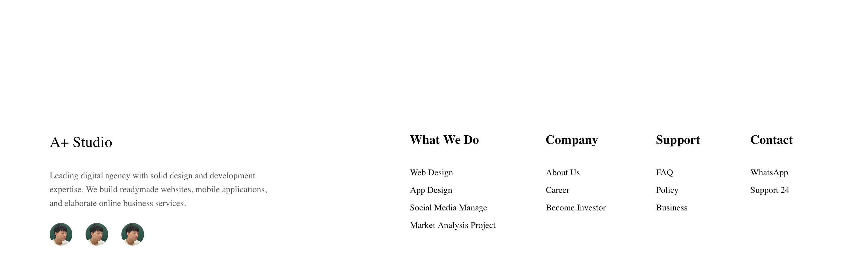
效果:
11. 补充
11.1 矩形绘制
前面写静态页的时候,有一部分背景图形是直接使用图片,但是拉伸效果不好,所以补充使用div来画矩形,以适应不同宽度的浏览器。
首先是headline的这两个矩形:
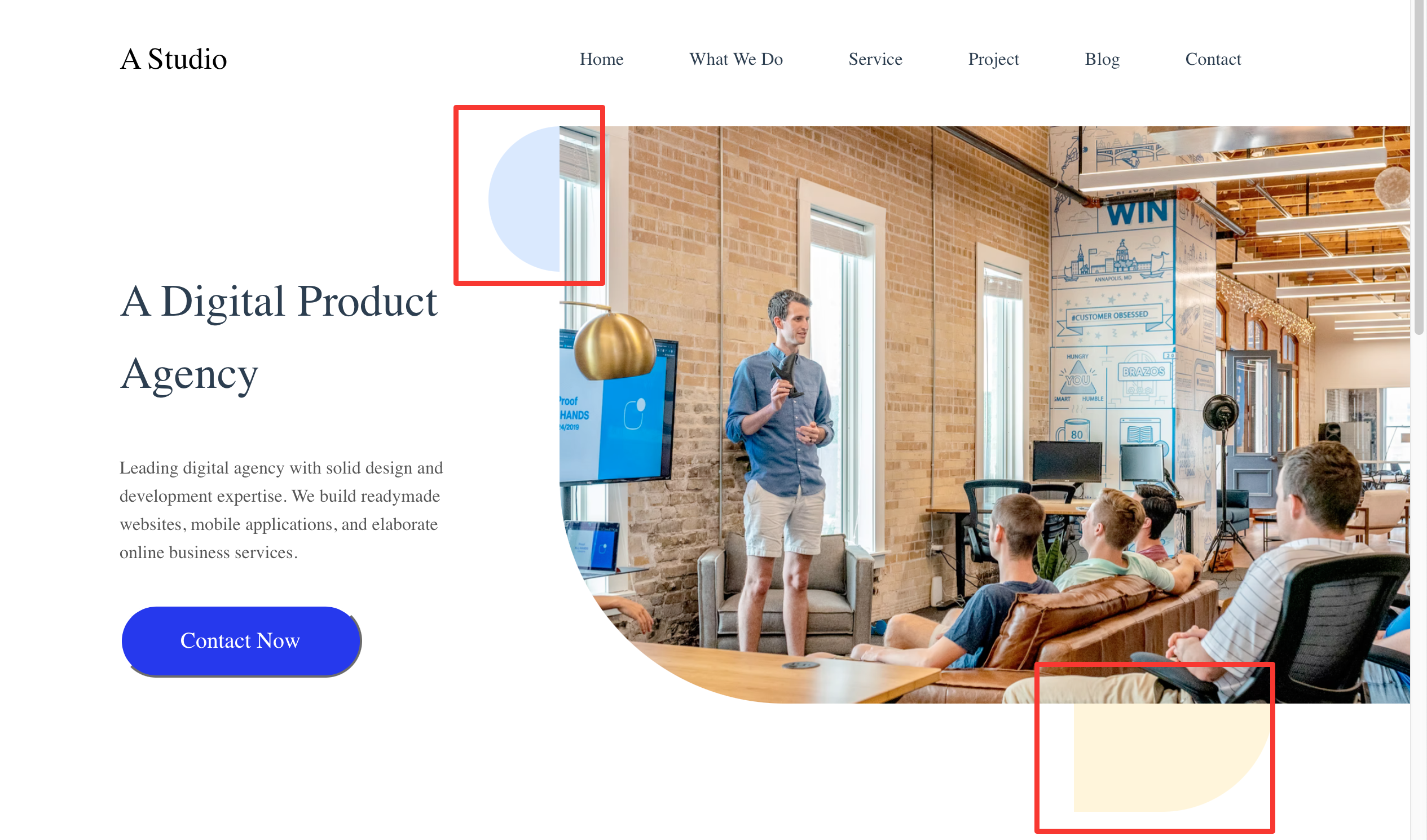
在right_part中加上两个div,并用相对位置和绝对位置固定。
// template
<div class="right_part">
    <div class="rectangle1"></div>
    <div class="rectangle2"></div>
    <img src="../assets/headimg.png" alt="">
</div>

//style
.right_part {
    min-width: 817px;
    height: 100%;
    overflow: auto;
    position: relative;
    /* background-color: red; */
}

.right_part img {
    height: 512px;
    width: 754px;
    /* min-width: 754px; */
    border-radius: 0px 0px 0px 200px;
    position: absolute;
    top: 0px;
    right: 0px;
    /* margin-left: 64.5px;
    margin-bottom: 89px; */
}

.rectangle1{
    position: absolute;
    top: 0px;
    left: 0px;
    width: 129px;
    height: 129px;
    background: #DAE9FF;
    border-radius: 500px 500px 500px 500px;
}

.rectangle2{
    position: absolute;
    bottom: 0px;
    right: 120px;
    width: 178px;
    height: 178px;
    background: #FFF5DB;
    border-radius: 0px 0px 100px 0px;
}
11.2 获得m3u8链接
上面提到过,那个视频播放插件无法播放本地视频,所以需要将视频上传到网络上,通过网络链接获取。
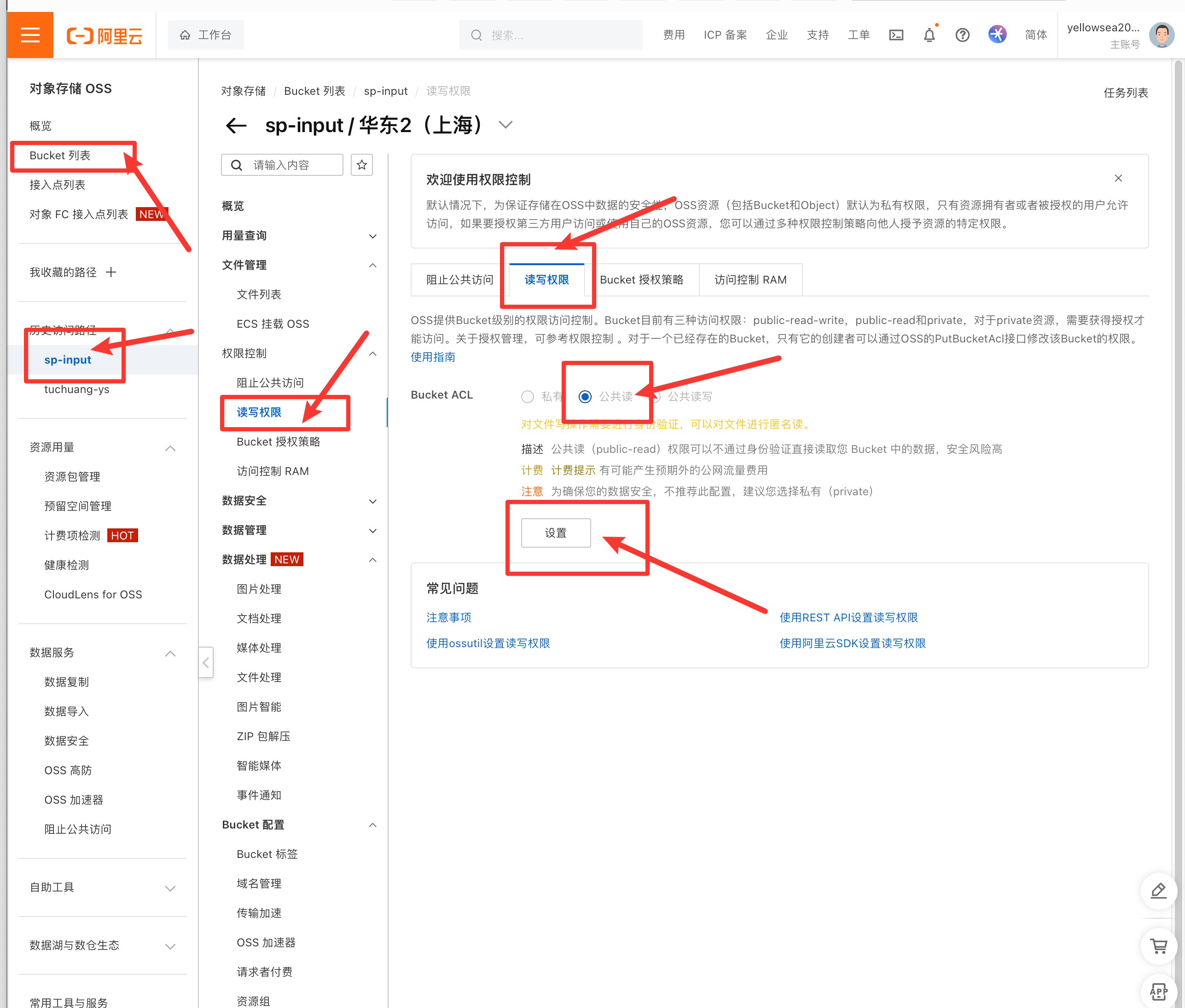
在此使用阿里云的媒体处理MPS和对象存储OSS实现。
- 新建媒体Bucket

- 新建工作流
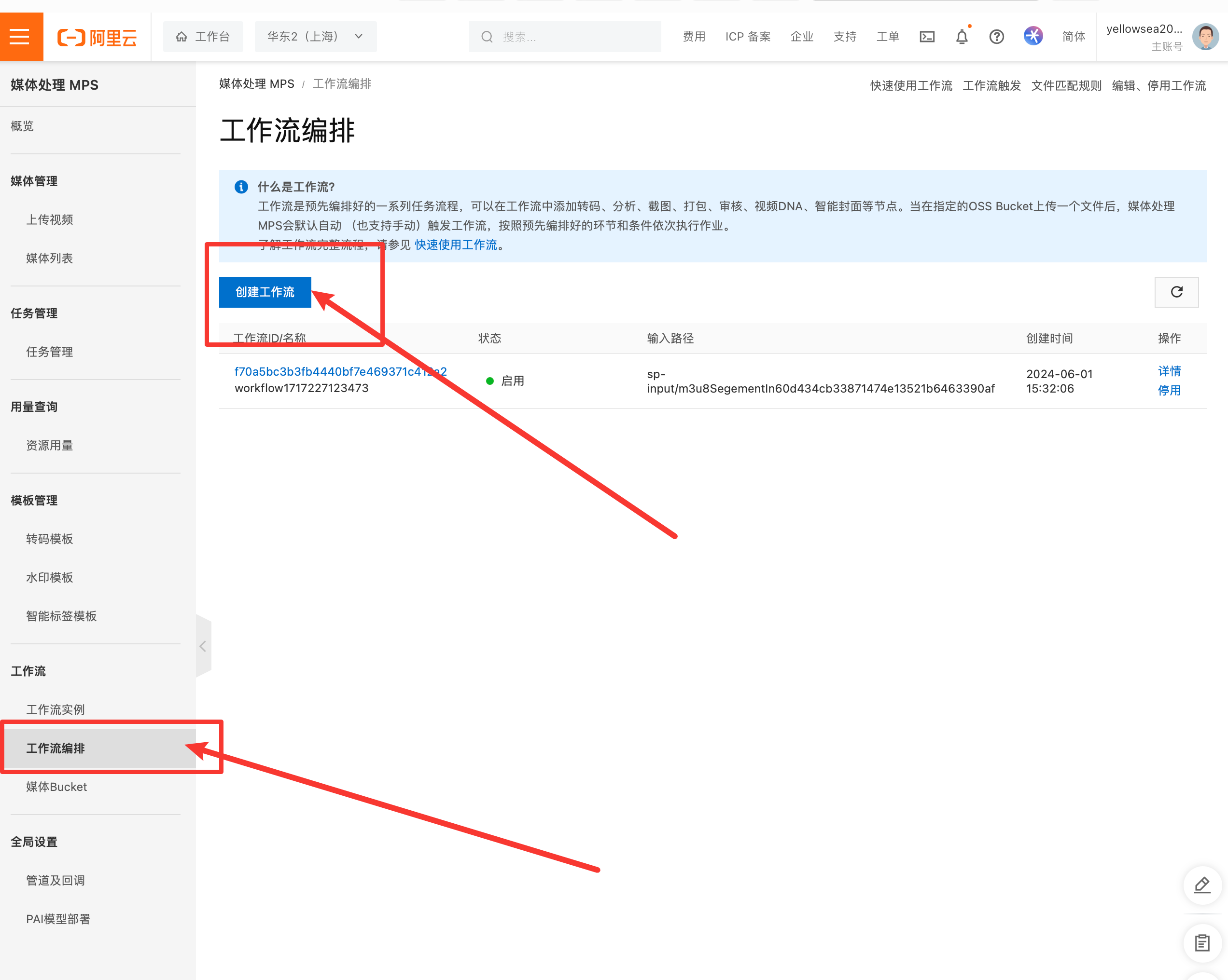
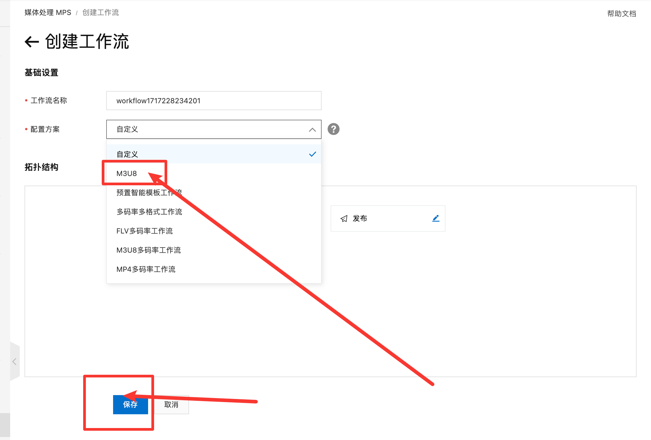
- 上传视频并发布
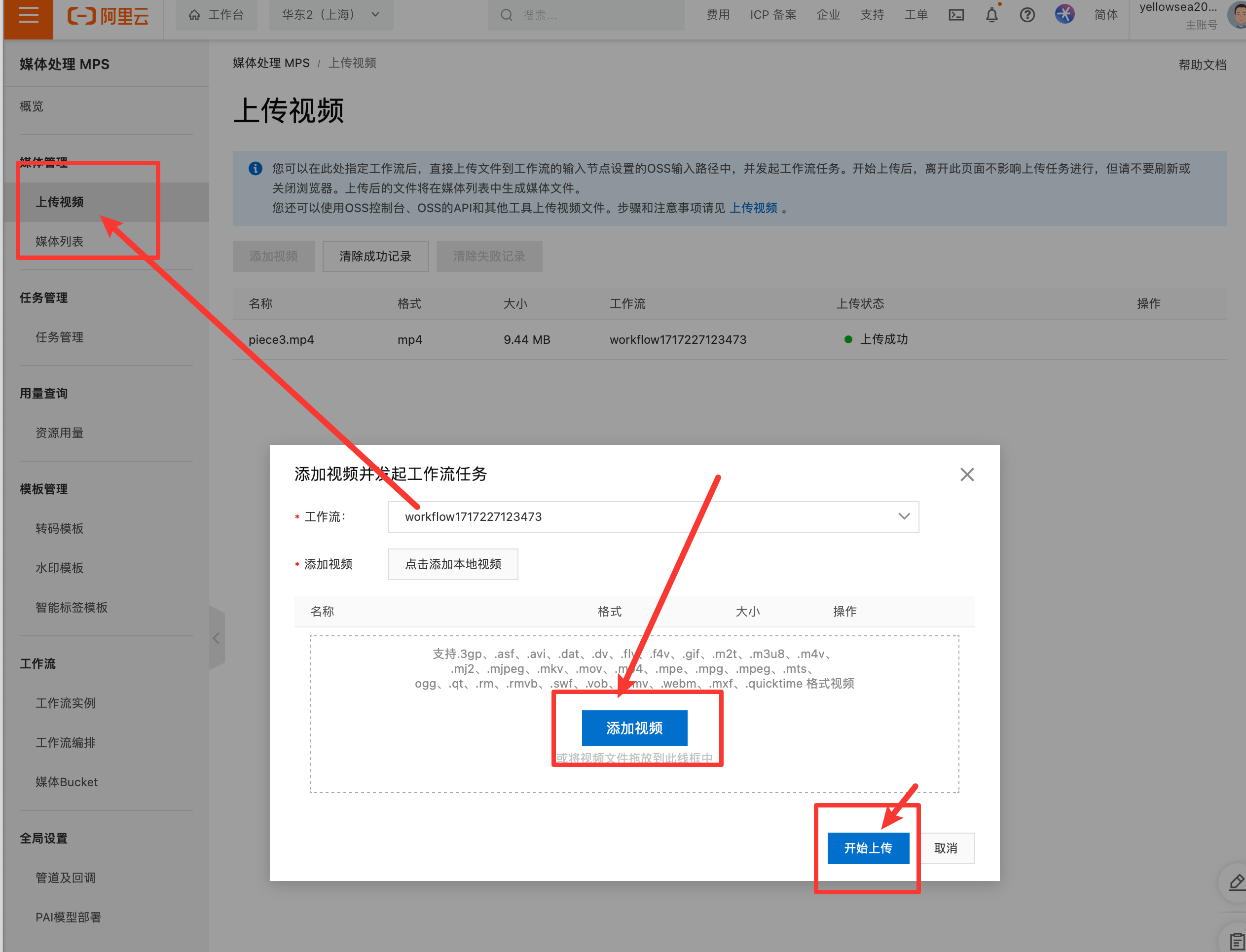
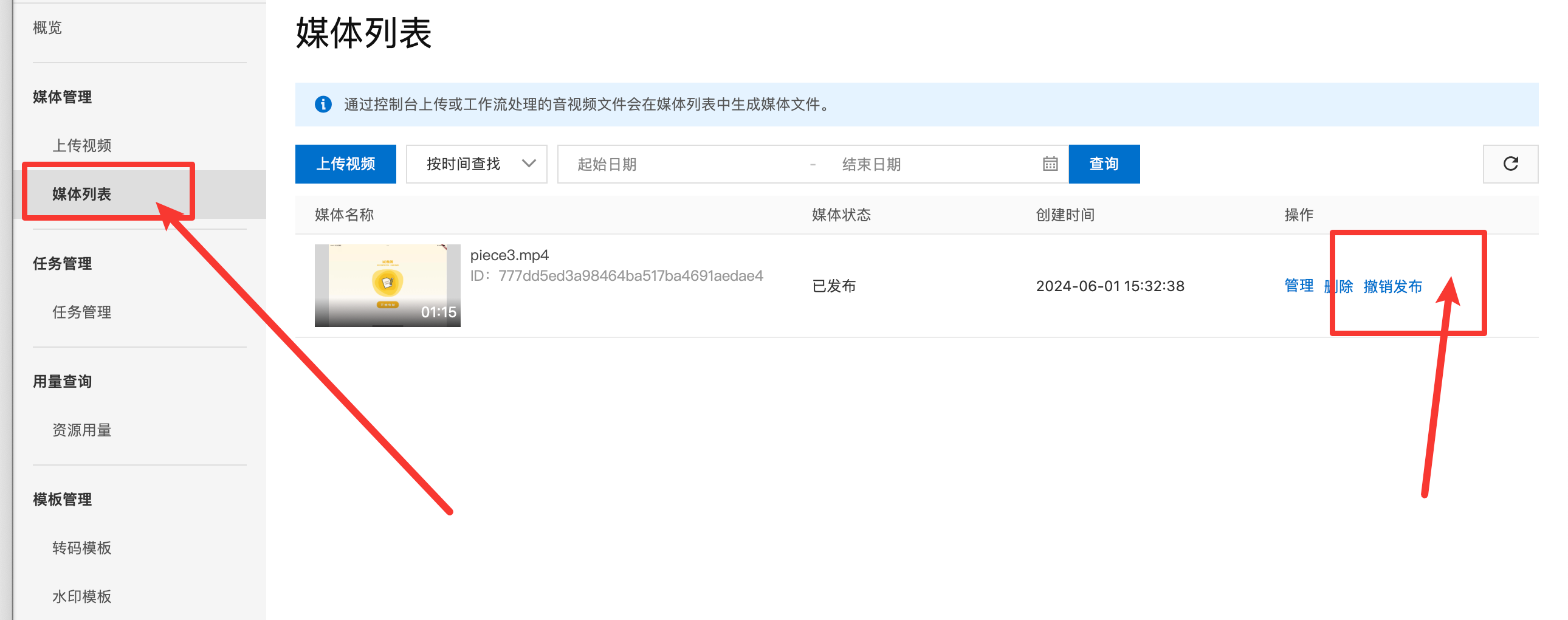
- 获取链接
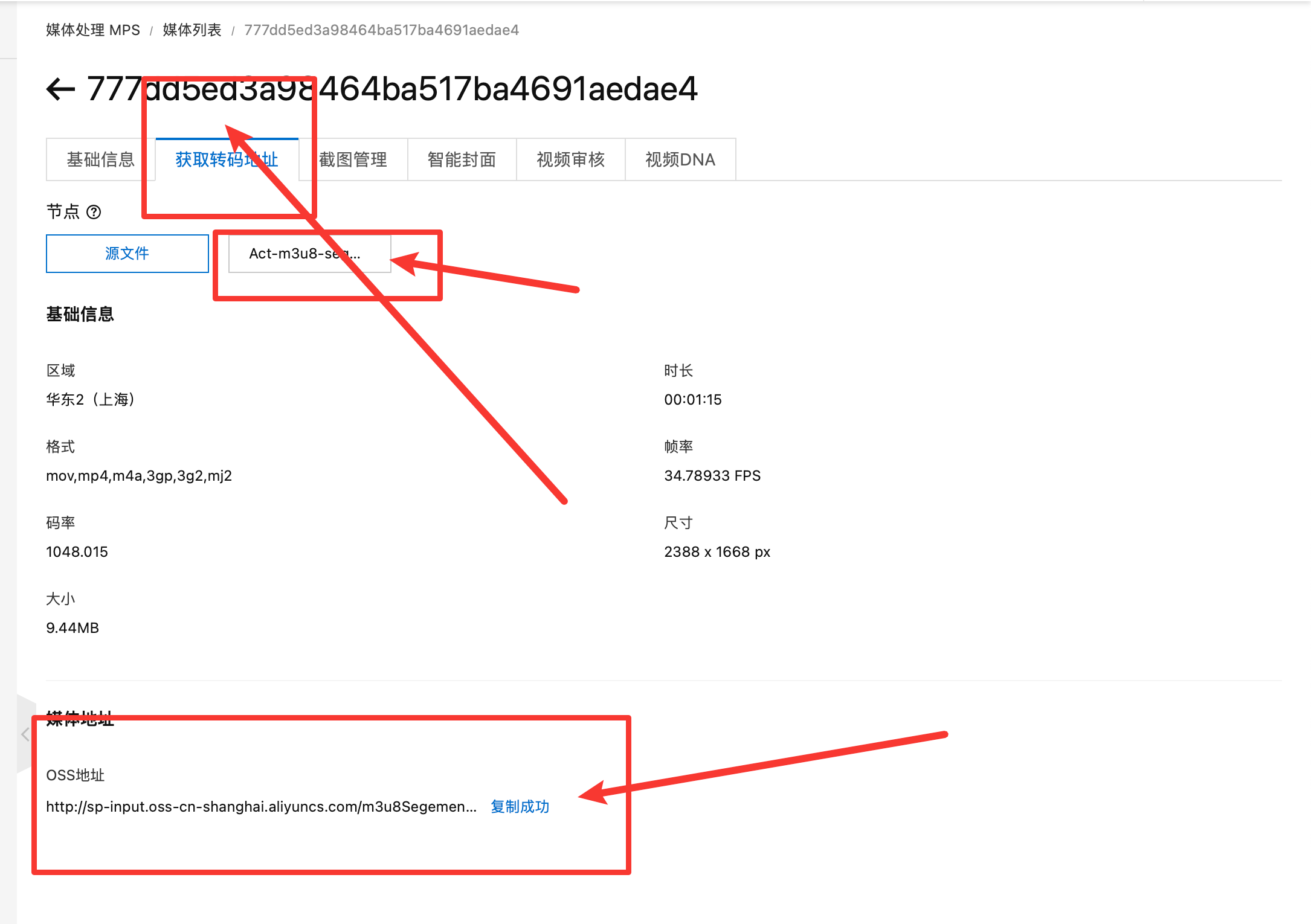
- OSS授权(不操作的话,链接会提示没权限)
11.3 限制最大宽度
之前在布局时,多使用flex布局,可以根据浏览器宽度自适应布局,在一定的宽度限制内效果还不错,但是如果宽度太大,会导致左右两边的组件之间有一个巨大的空白,很难看,所以需要限制一个最大的宽度,当超出这个宽度时,在两边使用空白填充。
只需要在home.vue的style部分添加下面代码。
max-width: 1440px;
/* 设置最大宽度 */
margin-left: auto;
/* 左侧自动填充 */
margin-right: auto;
/* 右侧自动填充 */
效果如下:
11.4 打开页面默认在顶部
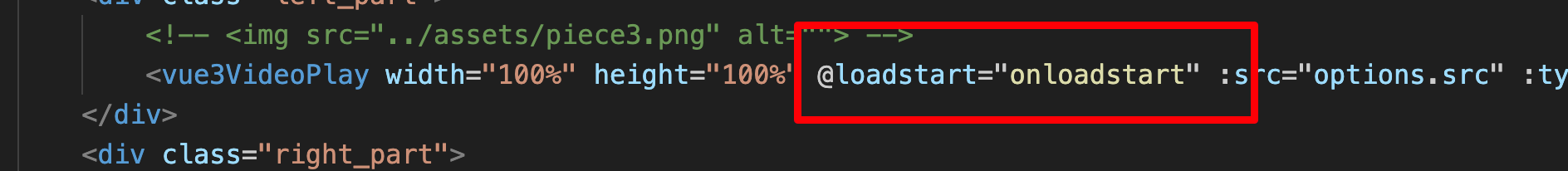
视频播放器有一个bug:在一开始打开页面的时候,会开始缓冲,缓冲时默认把页面滚动到播放器所在的位置。
但是我们想要打开时默认在顶部。
试过使用mounted钩子函数强制滚动到顶部,但是缓冲在后,结果是不生效。
认真查看了视频播放器的文档后,发现通过绑定事件,在缓冲开始时滚动到顶部,可以曲线救国。
const onloadstart = (ev) => {
  console.log("开始缓冲");
  window.scroll(0, 0);
};
五、修改内容
1. 网页内的内容
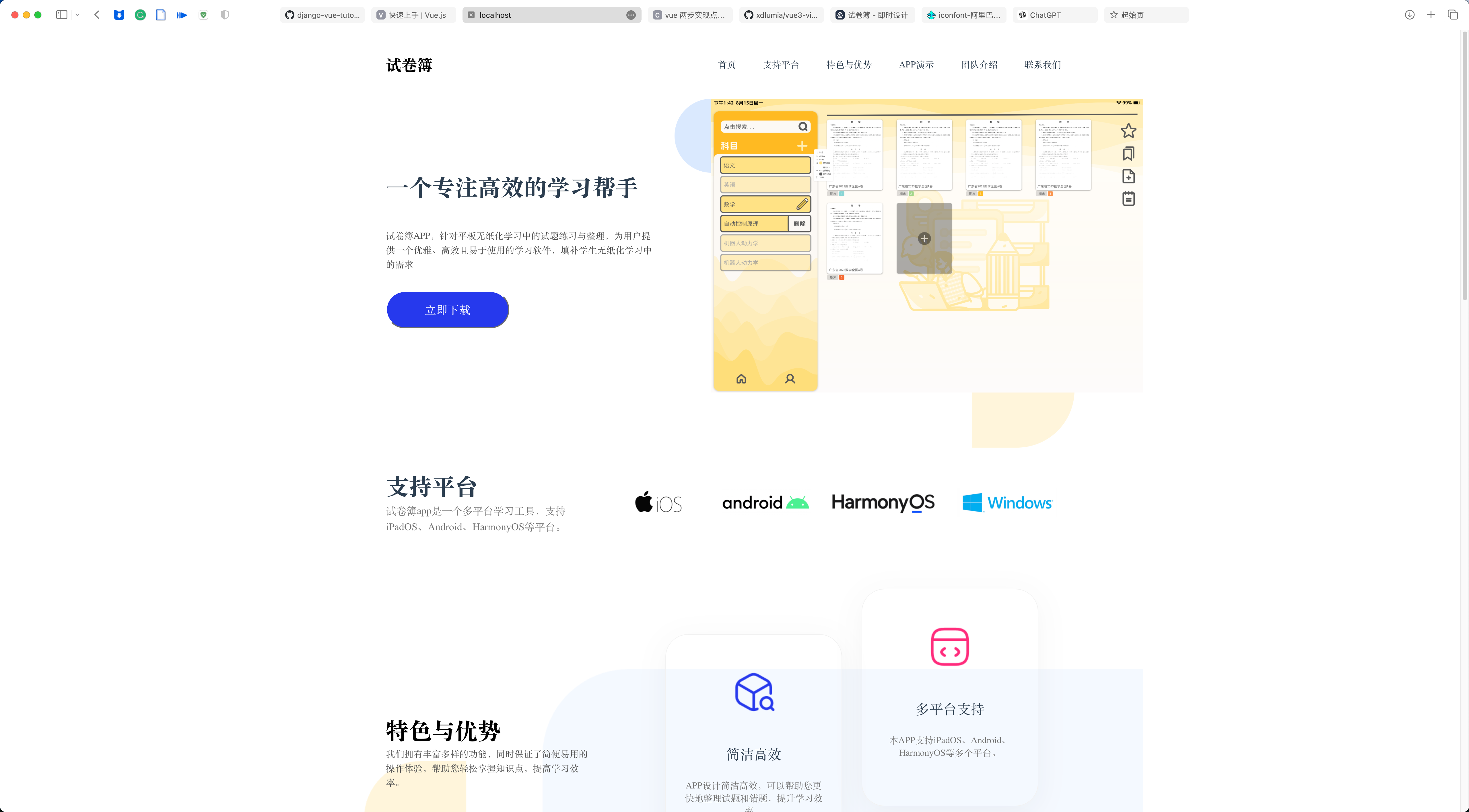
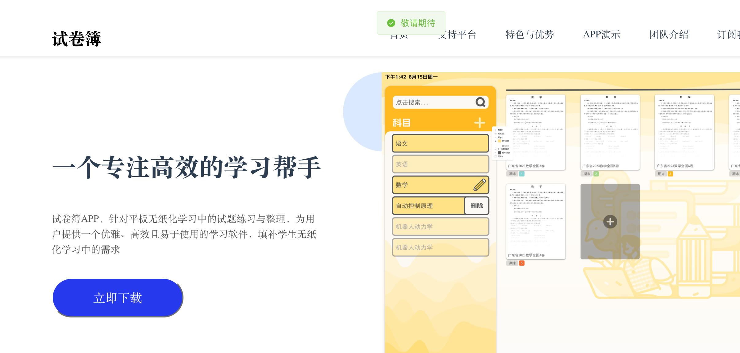
以上,前端静态部分的所有布局都画好了,接下来要根据实际情况将内容修改成我们自己的。
在这里,我想要做的是我们开发的一款app的介绍,所以将页面改成了以下。(由于只需要修改内容,所以代码就不展示了)
2. 网页标题与图标
-
将我们想用的图标替换掉
public/favicon.ico -
修改根目录下的
index.html文件:
<!DOCTYPE html>
<html lang="en">
  <head>
    <meta charset="UTF-8">
    <link rel="icon" href="/public/favicon.ico"> <!-- 改这里 -->
    <meta name="viewport" content="width=device-width, initial-scale=1.0">
    <title>试卷簿——专注高效的学习帮手</title> <!-- 改这里 -->
  </head>
  <body>
    <div id="app"></div>
    <script type="module" src="/src/main.js"></script>
  </body>
</html>
- 刷新即可看到修改成功。
六、动态部分
1. 顶部栏
1.1 固定在顶部
这个严格上不算是动态部分,可以直接通过css布局设置实现,只不过我前面忘记做了,就在此补充上。
home.vue文件中设置布局
<!-- 此处加个class和style -->
<TopBar class="fixed-top" />
<Headline style="margin-top: 116px;"/>

<!-- style中加上以下css -->
<style scoped>
.fixed-top {
  position: fixed;
  top: 0;
  left: 0;
  width: 100%; /* 可以根据需要设置宽度 */
  z-index: 999;
  background-color: white; /* 可以根据需要设置背景颜色 */
  /* 其他样式属性 */
}
</style>
TopBar.vue更改css
.bar {
    display: flex;
    justify-content: space-between;
  	/* margin要改成padding */
    padding-top: 42px;
    padding-left: 120px;
    padding-right: 120px;
    padding-bottom: 10px;
    box-shadow: 0px 2px 4px rgba(0, 0, 0, 0.1); /* 加上底部阴影好看一些*/
    /* margin-top: 42px;
    margin-left: 120px;
    margin-right: 120px; */
}
1.2 点击跳转指定位置
由于各个组件的高度是固定不变的,所以直接使用document.documentElement.scrollTop即可实现。
- 定义函数
<script>
export default {
  methods: {
    roll(where) {
      console.log('Div 被点击了!');
      // 在这里可以执行你想要的函数逻辑
      document.documentElement.scrollTop = where;
    }
  }
}
</script>
- 给标签绑定函数
<template>
    <div class="bar">
        <div class="name">试卷簿</div>
        <div class="label">
            <div @click="roll(0)">首页</div>
            <div @click="roll(650)">支持平台</div>
            <div @click="roll(900)">特色与优势</div>
            <div @click="roll(1850)">APP演示</div>
            <div @click="roll(2400)">团队介绍</div>
            <div @click="roll(3000)">订阅我们</div>
        </div>
    </div>
</template>
2. 两个按钮
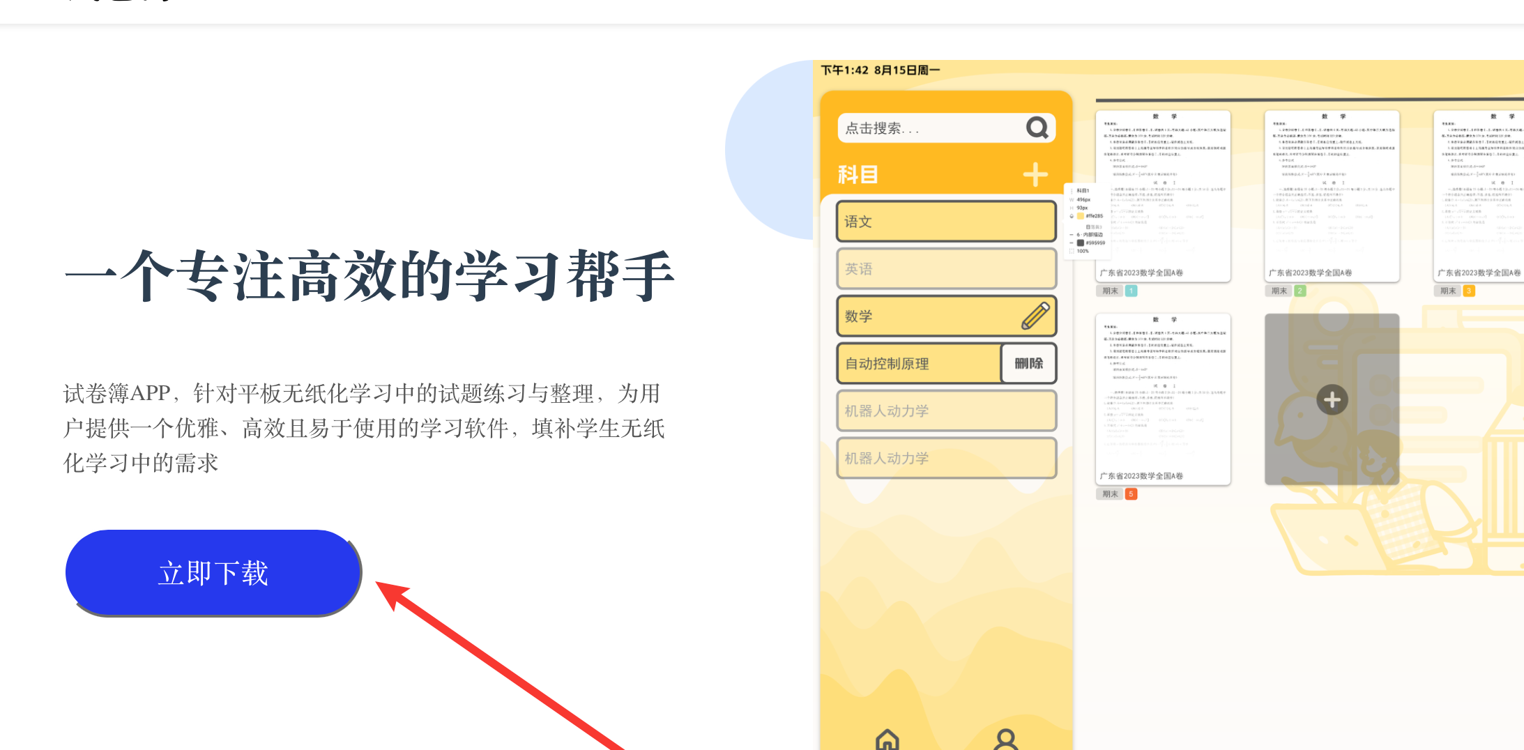
这两个按钮,“立即下降”按钮只需要绑定一个下载链接即可,下载链接可以使用阿里云oss来获取,具体方法和之前视频m3u8链接获取差不多,就不过多赘述。
“提交”按钮需要绑定一个数据库操作的接口,将输入框中的内容加入到数据库中。
由于目前没有可以下载的东西和数据库操作的接口,所以就简单绑定了一个函数给个消息框。代码就不展示了。
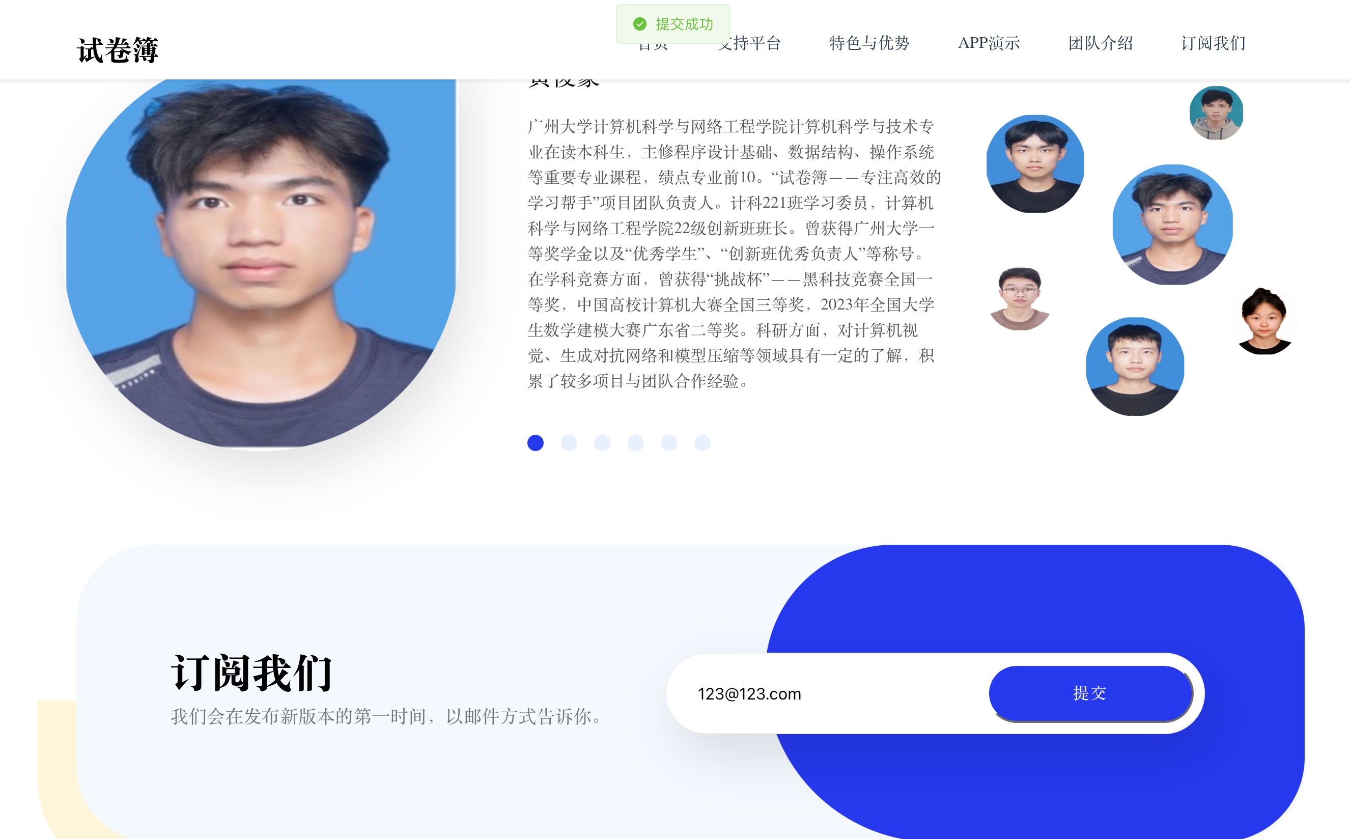
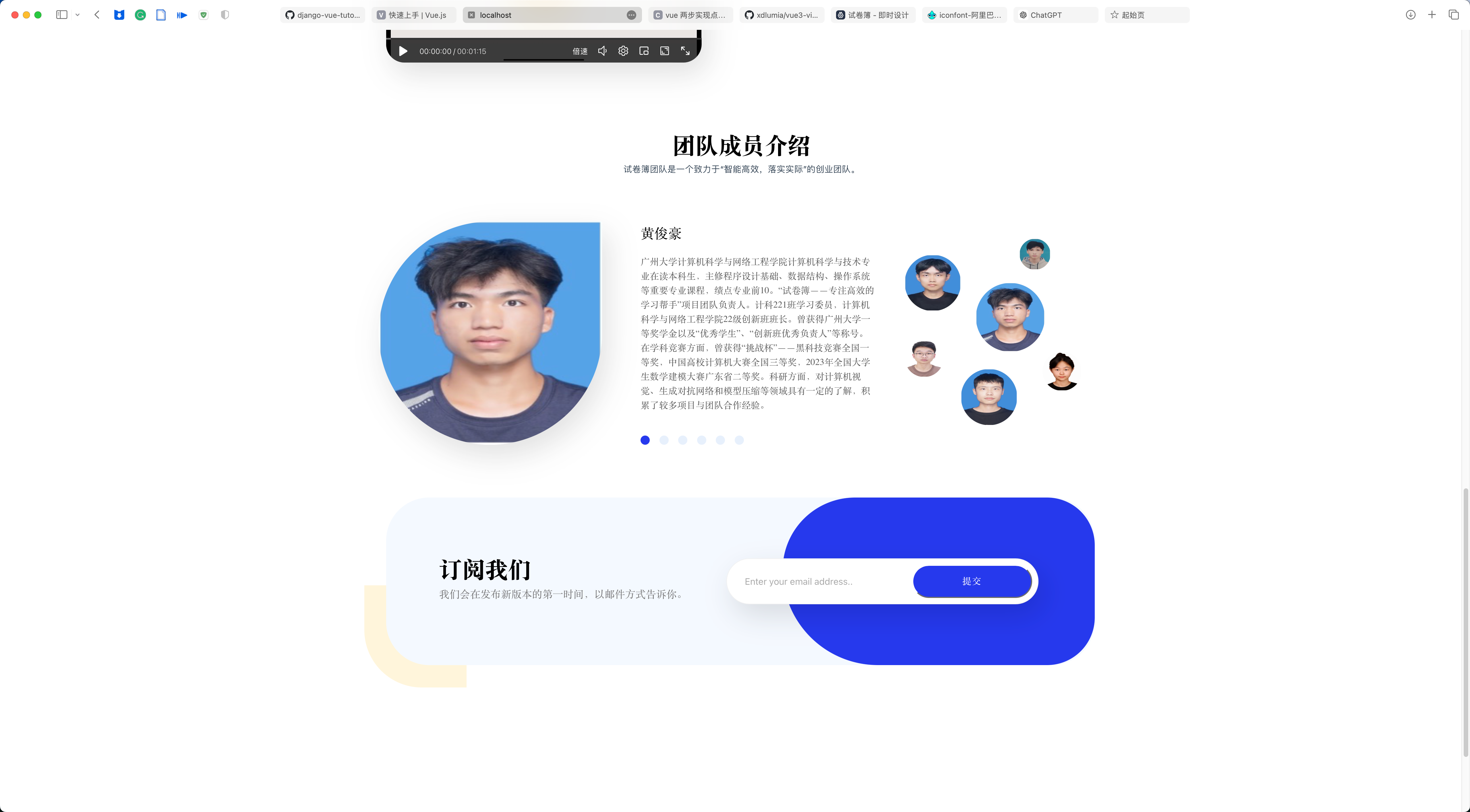
3. 成员介绍
成员介绍部分,需要做到可以点击下面的选择按钮,切换到对应的成员信息去。
template部分:
<div class="member-info" v-if="selectedMember">
  <img :src="selectedMember.avatar" alt="Member Avatar" class="bottom_1" />
  <div class="bottom_2">
      <p class="bottom_text1">{{ selectedMember.name }}</p>
      <p class="bottom_text2">{{ selectedMember.description }}</p>
      <div class="select">
          <div v-for="(member, index) in teamMembers" :key="index"
              :class="['option', { selected: selectedMemberIndex === index }]"
              @click="selectMember(index)">
          </div>
      </div>
  </div>
</div>
script部分:
<script>
import avatar1 from '../assets/people/hjh.jpg';
import avatar2 from '../assets/people/zwj.jpg';
import avatar3 from '../assets/people/hh.png';
import avatar4 from '../assets/people/jty.jpg';
import avatar5 from '../assets/people/sbq.png';
import avatar6 from '../assets/people/zjx.jpg';

export default {
    data() {
        return {
            selectedMemberIndex: 0,
            teamMembers: [
                {
                    avatar: avatar1,
                    name: '111',
                    description: '1的介绍',
                },
                {
                    avatar: avatar2,
                    name: '222',
                    description: '2的介绍',
                },
                {
                    avatar: avatar3,
                    name: '333',
                    description: '3的介绍',
                },
                {
                    avatar: avatar4,
                    name: '444',
                    description: '4的介绍',
                },
                {
                    avatar: avatar5,
                    name: '555',
                    description: '5的介绍',
                },
                {
                    avatar: avatar6,
                    name: '666',
                    description: '6的介绍',
                },
            ],
        };
    },
    computed: {
        selectedMember() {
            return this.teamMembers[this.selectedMemberIndex];
        },
    },
    methods: {
        selectMember(index) {
            this.selectedMemberIndex = index;
        },
    },
};
</script>
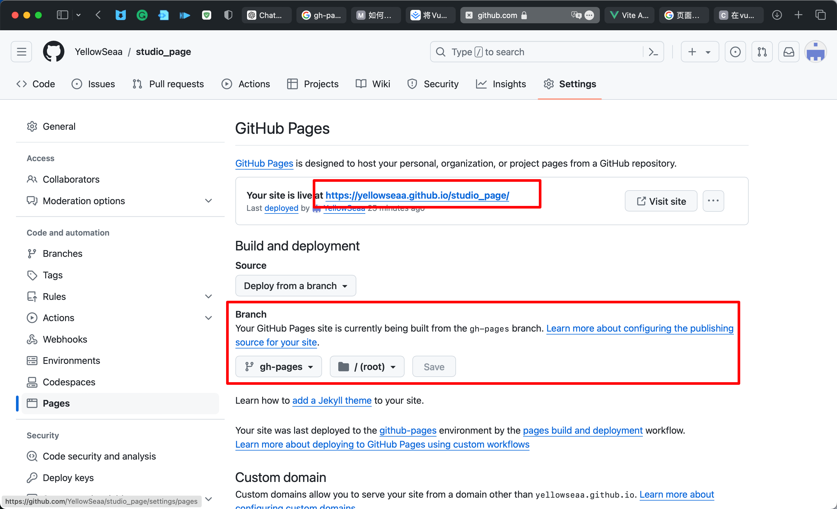
七、部署到github上
以上,web页面基本完成,接下来就是将其部署到GitHub上。
参考教程:参考
- 先新建一个github仓库,具体怎么操作就不详细讲。
- 将代码上传到仓库中。
- 修改配置文件
打开项目中的vite.config.js,找到下面代码块,更改为对应的 github 仓库名称
export default defineConfig({
    base: '/your_repositories_name/', // github仓库名称
    plugins: [],
})
- 编译vue代码
npm run build
- 将编译后的代码上传到仓库中
先要在.gitignore文件中将dist文件夹的忽略给注释掉。
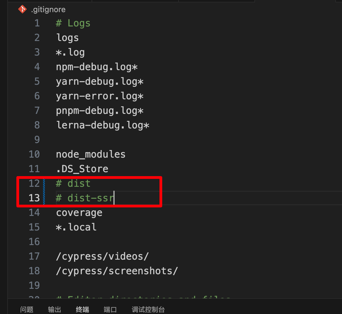
然后用git将该文件夹上传到指定分支。
git add dist
git commit -m "Your commit message"
git subtree split --prefix dist -b dist-branch
git push your_repositories_name dist-branch:gh-pages # 这里要改成具体的仓库名
git branch -d dist-branch
最后在仓库的设置中打开github page即可。