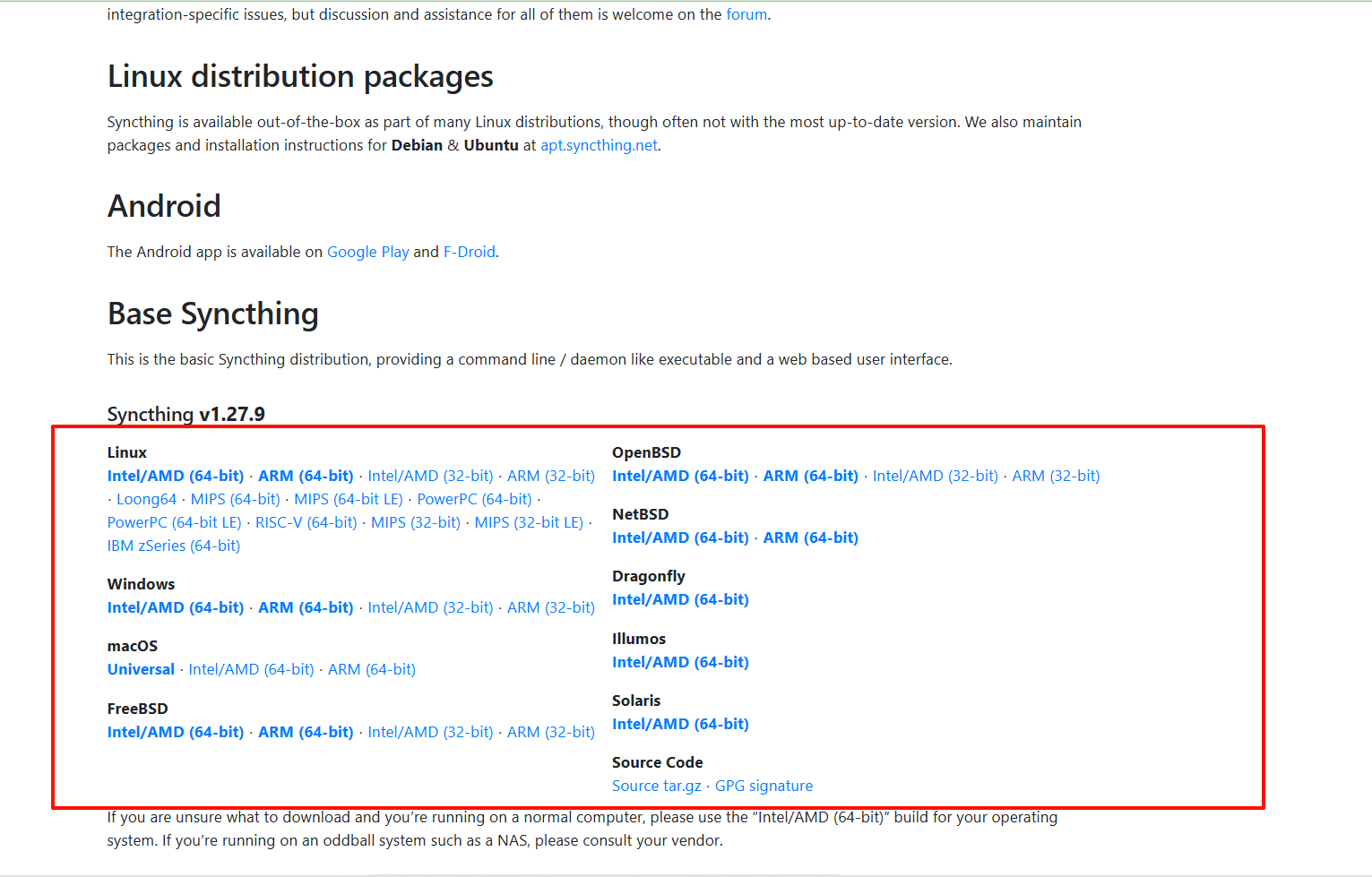
uni-app 弹出层组件的实现
以下是一个简单的 uni-app 弹出层组件的实现代码示例,它可以根据传递的属性来控制弹出层的显示和隐藏:
<template>
  <view
    class="overlay "
    v-show="visible"
    @click="close"
    :class="{
			'center' : position==='center' ,
			'bottom' : position==='bottom',
			'top' : position==='top',
			}"
  >
    <view
      class="modal"
      @click.stop
      :class="{
			'bottom-modal' : position==='bottom',
			'bottom-modal-fadein': position==='bottom',
			'top-modal' : position==='top',
			'top-modal-fadein': position==='top',
			}"
    >
      <slot></slot>
    </view>
  </view>
</template>

<script>
  export default {
    name: "popup",
    props: {
      visible: {
        type: Boolean,
        default: false,
      },
      position: {
        type: String,
        default: "bottom",
      },
    },
    methods: {
      close() {
        this.$emit("update:visible", false);
      },
    },
  };
</script>

<style scoped>
  .overlay {
    position: fixed;
    top: 0;
    left: 0;
    width: 100%;
    height: 100%;
    background-color: rgba(0, 0, 0, 0.5);
    z-index: 999;
    display: flex;
  }

  .center {
    justify-content: center;
    align-items: center;
  }

  .modal {
    background-color: #fff;
    padding: 20px;
    border-radius: 10px;
  }

  .bottom {
    justify-content: center;
    align-items: flex-end;
  }

  .bottom-modal {
    bottom: 0;
    width: 100%;
    min-height: 100px;
    border-radius: 10px 10px 0 0;
  }

  .bottom-modal-fadein {
    animation: bottom-top-fadein 500ms linear;
  }

  /* 自下到上淡入 */
  @keyframes bottom-top-fadein {
    0% {
      transform: translate(0, 100%);
    }

    100% {
      transform: none;
    }
  }

  .top {
    justify-content: center;
    align-items: flex-start;
  }

  .top-modal {
    top: 0;
    width: 100%;
    min-height: 100px;
    border-radius: 0 0 10px 10px;
  }

  .top-modal-fadein {
    animation: top-bottom-fadein 500ms linear;
  }

  /* 自上到下淡入 */
  @keyframes top-bottom-fadein {
    0% {
      transform: translate(0, -100%);
    }

    100% {
      transform: none;
    }
  }
</style>
在使用此组件时,可以通过传递“visible”属性来控制弹出层的显示和隐藏。可以在组件的插槽中添加内容。例如,以下代码将创建一个弹出层,当按钮被点击时显示:
<template>
  <view>
    <button @click="showModal">Show Modal</button>
    <popup
      :visible="modalVisible"
      position="bottom"
      @update:visible="modalVisible = $event"
    >
      <h2>Modal Title</h2>
      <p>Modal content goes here...</p>
      <button @click="modalVisible = false">Close</button>
    </popup>
  </view>
</template>

<script>
  // 在根目录下的 components 文件夹添加的组件无需导入

  export default {
    data() {
      return {
        modalVisible: false,
      };
    },
    methods: {
      showModal() {
        this.modalVisible = true;
      },
    },
  };
</script>